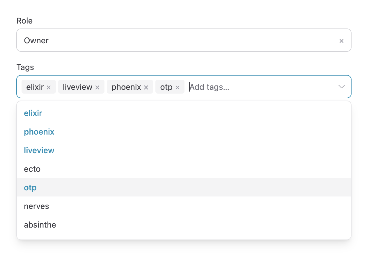
# Phoenix Select
> An accessible select, multi-select, and searchable combobox for Phoenix
LiveView with no external JS dependencies. Simple installation that's easy to
maintain.
## Demo
The [`/examples`](examples/) directory contains many examples, including a full
Phoenix demo app that demonstrates the different options:
```
git clone https://github.com/chrislaskey/phoenix_select.git
cd phoenix_select/examples/demo
mix setup && iex -S mix phx.server
```
Note: the script `examples/regenerate.sh` can be used to regenerate the demo from a pinned
`phx.new` release.
## Requirements
Phoenix Select requires Phoenix LiveView `v1.1` or greater. Specifically:
```
{:phoenix_live_view, ">= 1.1.0"},
{:phoenix_html, ">= 4.0.0"},
{:plug, ">= 1.14.0"},
```
The library leverages features released in `v1.1` to make installation and future upgrades even easier.
## Installation
The dropdown renders on the server. A single colocated hook (shipped inside
the library, extracted at compile time by LiveView 1.1+) adds what markup
alone cannot: keyboard navigation following the WAI-ARIA combobox pattern,
client-side filtering, and focus management. There is no npm package to
install and no file to vendor — the JS upgrades atomically with the Hex
package.
```elixir
def deps do
[
{:phoenix_select, github: "chrislaskey/phoenix_select"}
]
end
```
Requires LiveView `~> 1.1` and Phoenix 1.8+ (for colocated hook support).
Register the hooks in `assets/js/app.js` — this is the entire JS setup:
```javascript
import {hooks as phoenixSelectHooks} from "phoenix-colocated/phoenix_select"
const liveSocket = new LiveSocket("/live", Socket, {
hooks: {...colocatedHooks, ...phoenixSelectHooks},
// ...
})
```
If you use Tailwind, add the library to your `@source` paths in `app.css`:
```css
@source "../../deps/phoenix_select/lib";
```
## Usage
### Form mode (default)
Render inside your own `<.form>`; the selection participates in the form
like any native input, driving `phx-change`/`phx-submit`:
```heex
<.form for={@form} phx-change="validate" phx-submit="save">
```
Multi selects submit array params (`user[tags][]`). An empty selection
submits `[""]` so that "clear all" reaches your handler —
`Ecto.Changeset.cast/4` filters the empty string out of array fields
automatically (prune it yourself for map-backed forms).
### URL params mode
Pass `param`, `uri`, and `params` instead of `field`/`name` and the
selection is written to the URL query string via `push_patch` — table/filter
state that survives refreshes and can be shared as a link. Your LiveView
only tracks `uri` and `params` in `handle_params/3`:
```heex
```
`reset_params` deletes params that no longer apply when the selection
changes — pagination, typically.
### Server-side search
By default options are filtered client-side: zero keystroke latency, best
for lists that fit comfortably in the DOM. For large or remote datasets,
pass `search_event` and handle it in the parent LiveView — the hook pushes
the event (debounced) as the user types instead of filtering locally:
```heex
```
```elixir
def handle_event("search_country", %{"id" => _id, "query" => query}, socket) do
{:noreply, assign(socket, :country_options, Countries.search(query))}
end
```
### Keyboard and accessibility
The rendered markup follows the WAI-ARIA combobox pattern:
`role="combobox"` input with `aria-expanded`, `aria-controls`,
`aria-autocomplete="list"`, and `aria-activedescendant` tracking the
highlighted option; `role="listbox"`/`role="option"` with `aria-selected`;
labelled remove/clear buttons.
| Key | Behavior |
| --- | --- |
| `ArrowDown` / `ArrowUp` | Open the dropdown / move the highlight |
| `Enter` | Select the highlighted option |
| `Escape` | Close the dropdown |
| `Backspace` (empty input, multiple) | Remove the last selected value |
| `Tab` | Close and move on |
## Reference
### `PhoenixSelect.select/1` attributes
| Attribute | Type | Default | Notes |
| --- | --- | --- | --- |
| `id` | `:string` | required | Unique DOM id, also used by the hook |
| `field` | `FormField` | `nil` | Form field, e.g. `@form[:role]` (form mode) |
| `name` | `:string` | `nil` | Input name when not using `field` (form mode) |
| `value` | `:any` | `nil` | Current value override; defaults to the field's value |
| `param` | `:string` | `nil` | Query param to write, e.g. `"filter[genre]"` (URL mode) |
| `uri` | `:string` | `nil` | Current URI from `handle_params/3` (URL mode) |
| `params` | `:map` | `%{}` | Current params from `handle_params/3` (URL mode) |
| `reset_params` | `:list` | `[]` | Params deleted whenever the selection changes (URL mode) |
| `options` | `:list` | required | `[{label, value}]` tuples or plain values |
| `multiple` | `:boolean` | `false` | Allow selecting more than one option |
| `label` | `:string` | `nil` | Label rendered above the input |
| `placeholder` | `:string` | `nil` | Placeholder for the search input |
| `disabled` | `:boolean` | `false` | Disables the input |
| `search_event` | `:string` | `nil` | Push this event to the parent instead of filtering client-side |
| `debounce` | `:integer` | `300` | Debounce in ms for `search_event` pushes |
| `class` | `:string` | `nil` | Extra classes for the outer container |
Exactly one integration must be chosen: `field`/`name` (form mode) or
`param` + `uri` (URL mode) — anything else raises at render.
## License
This project is licensed under the MIT License - see the [LICENSE](LICENSE) file for details.