# DynamicForm
> Dynamic forms for Phoenix LiveView with built-in validation -
> defined declaratively in HEEx or as (SurveyJS-compatible) data
## Architecture
DynamicForm renders complete, validated forms from a single definition. It follows common best practices
in Elixir and Phoenix, leveraging Ecto schemas to validate and cast form data.
A dynamic form definition can be written two ways:
- **Data** — [SurveyJS-compatible JSON](https://surveyjs.io/form-library/documentation)
(or maps/structs), for forms that are stored in a database, generated at
runtime, or built in a WYSIWYG editor.
- **Declarative** — `<:field>` slots inside ``, for forms
owned by application code and co-located with the template.
In declarative mode, everything is composed from slots:
- **`<:field>`** — every question and element in render order: text, comment,
dropdown, radiogroup, checkbox, boolean, rating, tagbox, file uploads, plus
html/image content blocks.
- **`<:group>`** — collects fields into a titled panel, with its own
conditional visibility.
- **`<:nested>`** — declares a repeating child form (a contact's list of
addresses); fields join it with `nested="name"` and the value becomes a
list of maps, validated per entry.
- **Slot bodies** — custom markup at three tiers: content blocks, custom
controls that receive the form field (the library keeps the label, errors,
and validation), and fully custom elements that receive the form.
## Examples
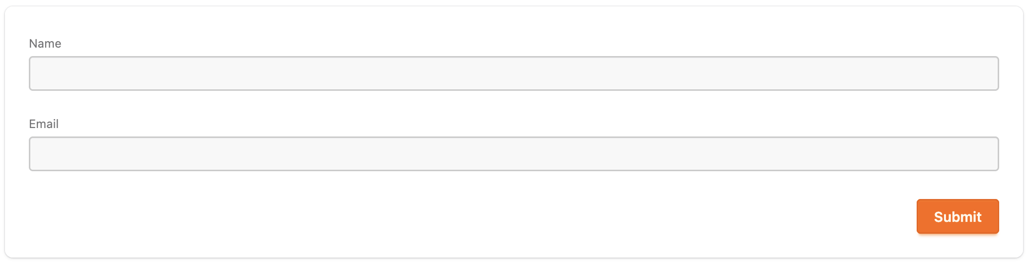
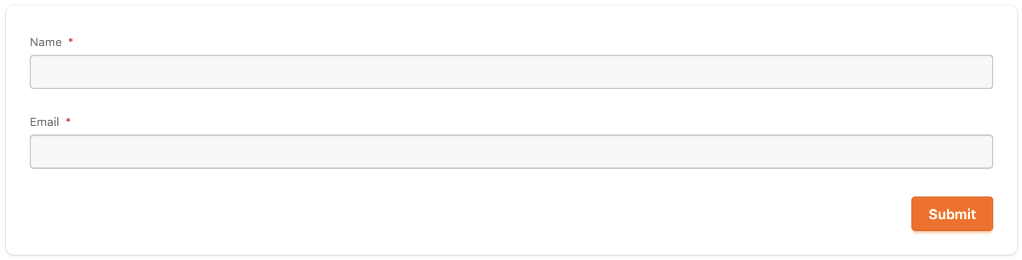
**A simple form**
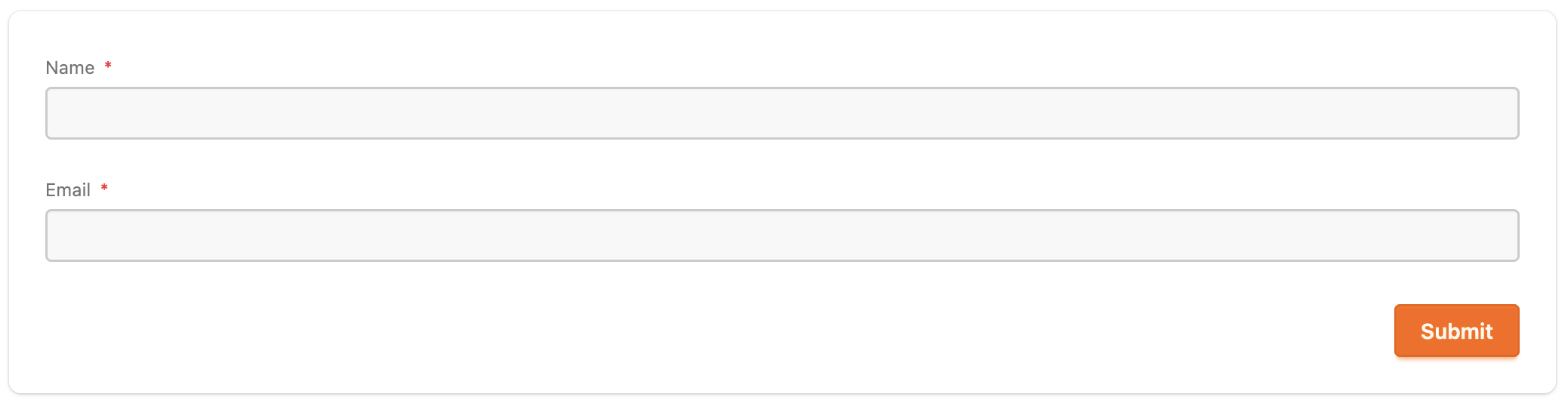
Forms are defined using the `` component. It can either be defined
in data or using component slots. The `<:field />` slots are rendered in order they are defined.
The library runs the whole validation lifecycle itself and messages the parent
LiveView on every valid submission — the `handle_info/2` handler is where the
side effect happens. The `payload` is a struct containing information about the
form, including the `data` key which is map of the submitted data.
```heex
<:field type="text" name="name" label="Name" required />
<:field type="text" name="email" label="Email" input_type="email" format="email" required />
```
```elixir
def handle_info({:dynamic_form, payload}, socket) do
{:ok, contact} = Contacts.create_contact(payload.data)
{:noreply, put_flash(socket, :info, "Created contact #{contact.id}")}
end
```
**Prefilling form data**
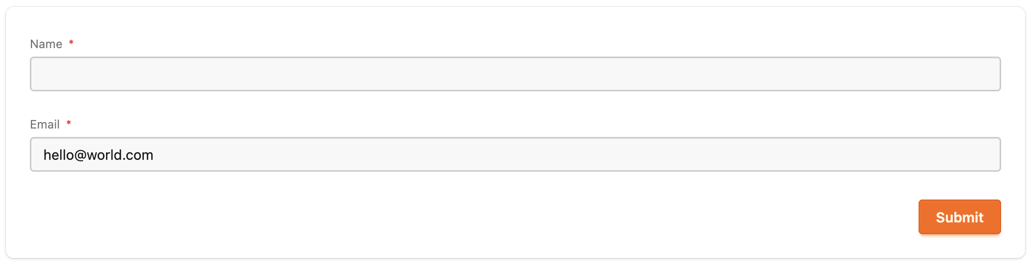
Use the `data` attribute to prefill the form with existing data:
```heex
<:field type="text" name="name" label="Name" required />
<:field type="text" name="email" label="Email" input_type="email" format="email" required />
```
**Lifecycle hooks**
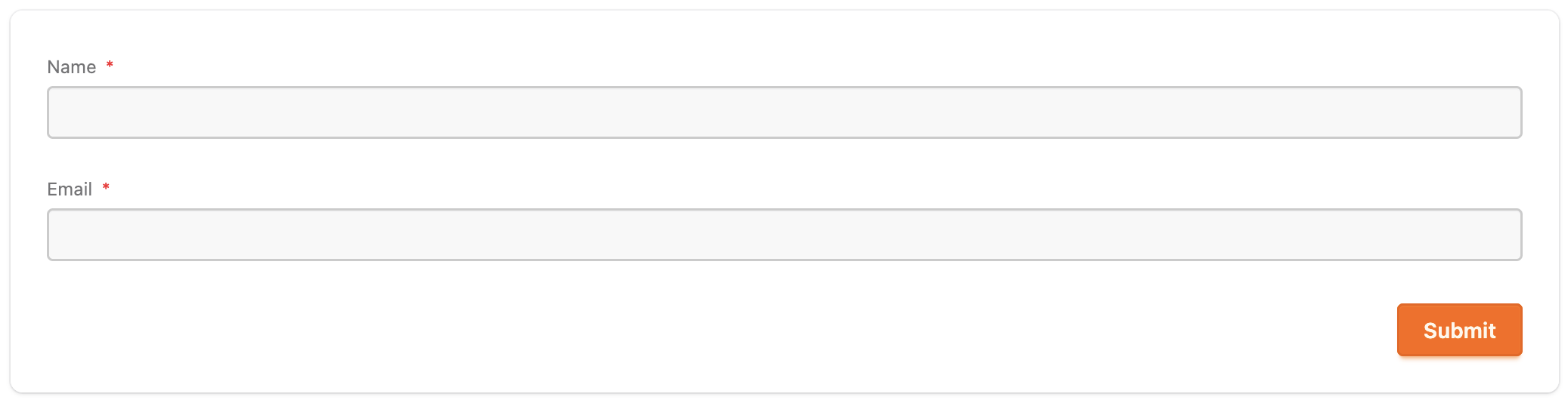
The `on_submit` attribute mirrors `phx-submit`: it runs on every submit — valid
or not — so expensive checks (like the uniqueness lookup below) batch with the
built-in errors into one complete list, rendered inline on the form.
See the [Lifecycle](guides/lifecycle.md) guide for more information on
`on_submit`, `on_change`, and `on_success` lifecycle hooks.
```heex
<:field type="text" name="name" label="Name" required />
<:field type="text" name="email" label="Email" input_type="email" format="email" required />
```
```elixir
def verify(payload) do
if email_taken?(payload.data[:email]) do
DynamicForm.Payload.add_error(payload, :email, "has already been taken")
else
payload
end
end
```
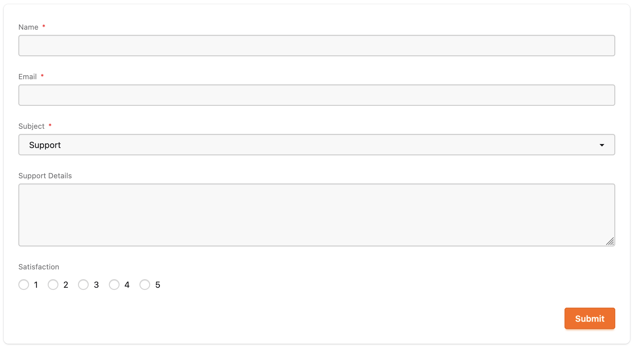
**Validation and visibility**
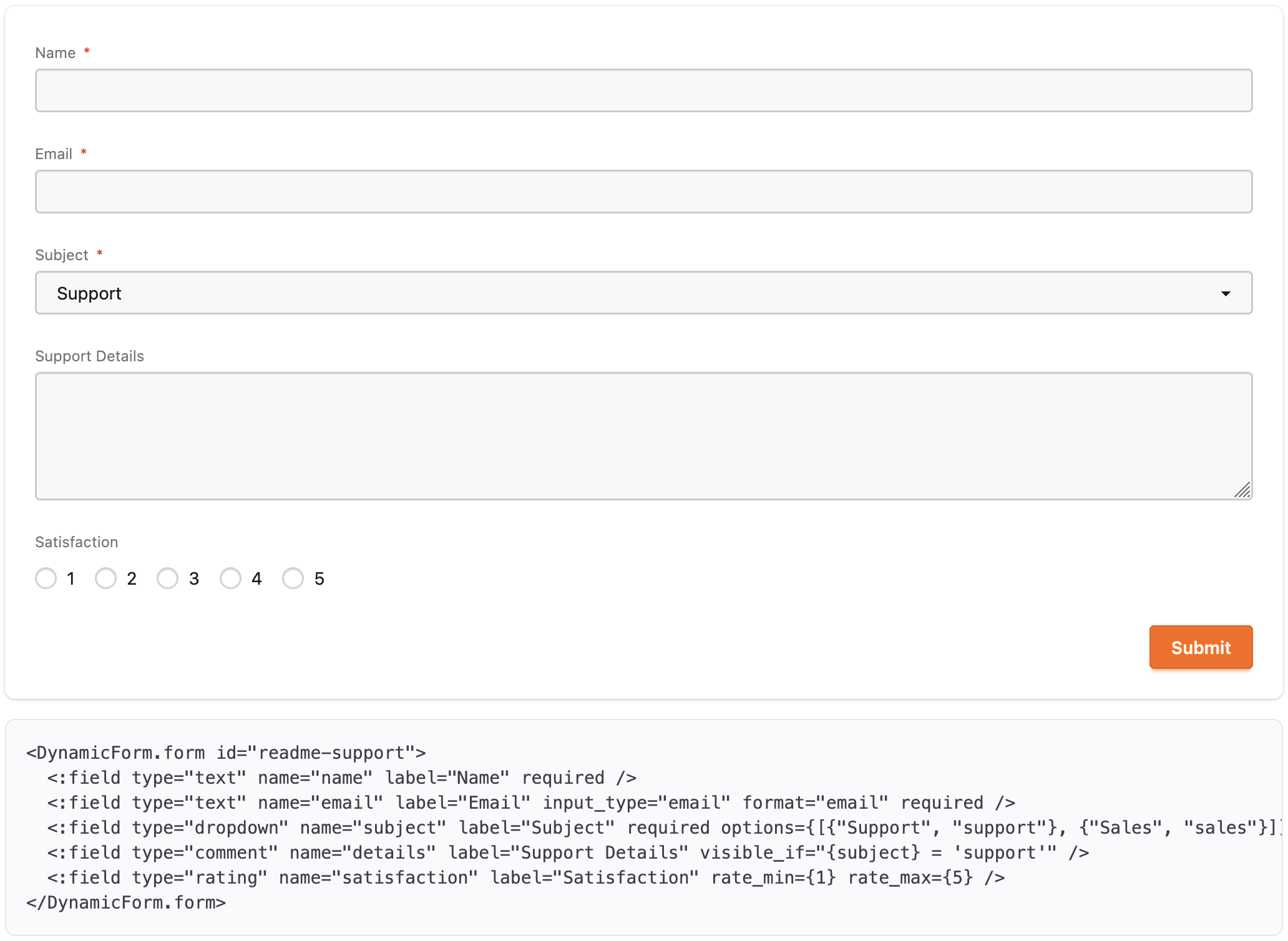
Layer in additional validation attrs and conditional visibility — the details
field only appears when the subject is `support`, and hidden required fields
are excluded from validation automatically:
```heex
<:field type="text" name="name" label="Name" min_length={2} required />
<:field type="text" name="email" label="Email" input_type="email" format="email" required />
<:field type="dropdown" name="subject" label="Subject" required options={[{"Support", "support"}, {"Sales", "sales"}]} />
<:field type="comment" name="details" label="Support Details" visible_if="{subject} = 'support'" />
<:field type="rating" name="satisfaction" label="Satisfaction" rate_min={1} rate_max={5} />
```
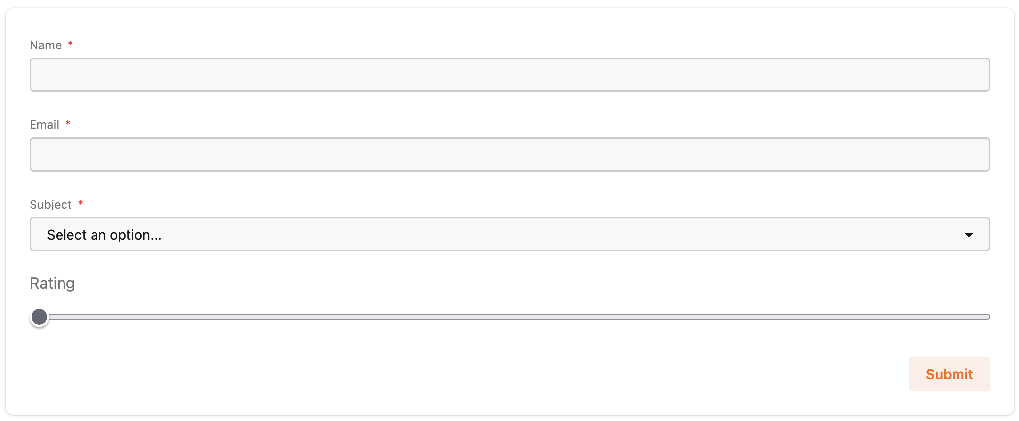
**Styling and custom fields**
The library uses a version of the CoreComponents module that's generated by new
Phoenix projects.
It can be configured to use your project's custom components. Either its
version of CoreComponents or a custom module. It can be configured globally in
the `config/config.ex` file or per-form using the `components` attribute.
When using a custom component module, the library is smart enough to fall back
to using the built-in version that ships with the library if a component is not
defined in the custom module.
Using a custom module is the preferred way to add custom fields as well as
change the styling of the forms. There is also the ability to define custom
syntax using the slot body.
See the [Styling](guides/styling.md) guide for detailed information on custom
inputs and styling.
```heex
<:field type="text" name="name" label="Name" min_length={2} required />
<:field type="text" name="email" label="Email" input_type="email" format="email" required />
<:field type="dropdown" name="subject" label="Subject" required options={[{"Support", "support"}, {"Sales", "sales"}]} />
<:field type="comment" name="details" label="Support Details" visible_if="{subject} = 'support'" />
<:field :let={field} type="rating" name="rating" label="Rating">
```
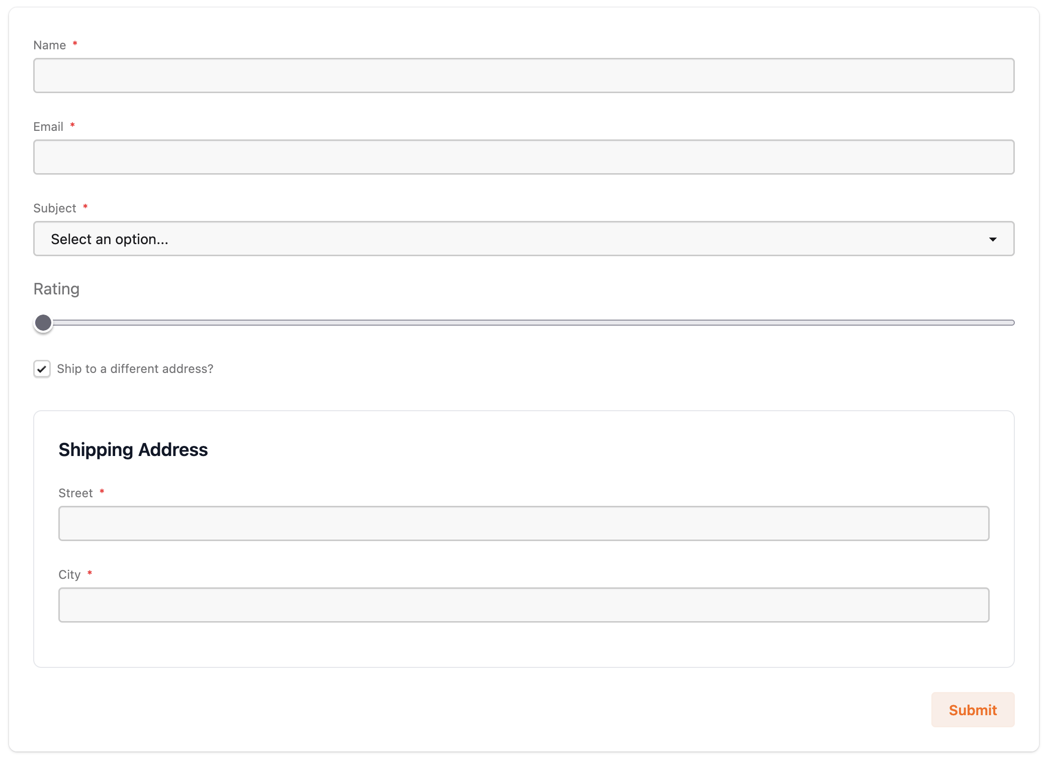
**Grouping fields**
Group fields into panels, and take over rendering where you need to — here a
custom range control via a slot body, while the library still owns the label,
errors, and changeset validation:
```heex
<:field type="text" name="name" label="Name" min_length={2} required />
<:field type="text" name="email" label="Email" input_type="email" format="email" required />
<:field type="dropdown" name="subject" label="Subject" required options={[{"Support", "support"}, {"Sales", "sales"}]} />
<:field type="comment" name="details" label="Support Details" visible_if="{subject} = 'support'" />
<:field :let={field} type="rating" name="rating" label="Rating">
<:field type="boolean" name="ship" label="Ship to a different address?" />
<:group name="address" title="Shipping Address" visible_if="{ship} = true" />
<:field group="address" type="text" name="street" label="Street" required />
<:field group="address" type="text" name="city" label="City" required />
```
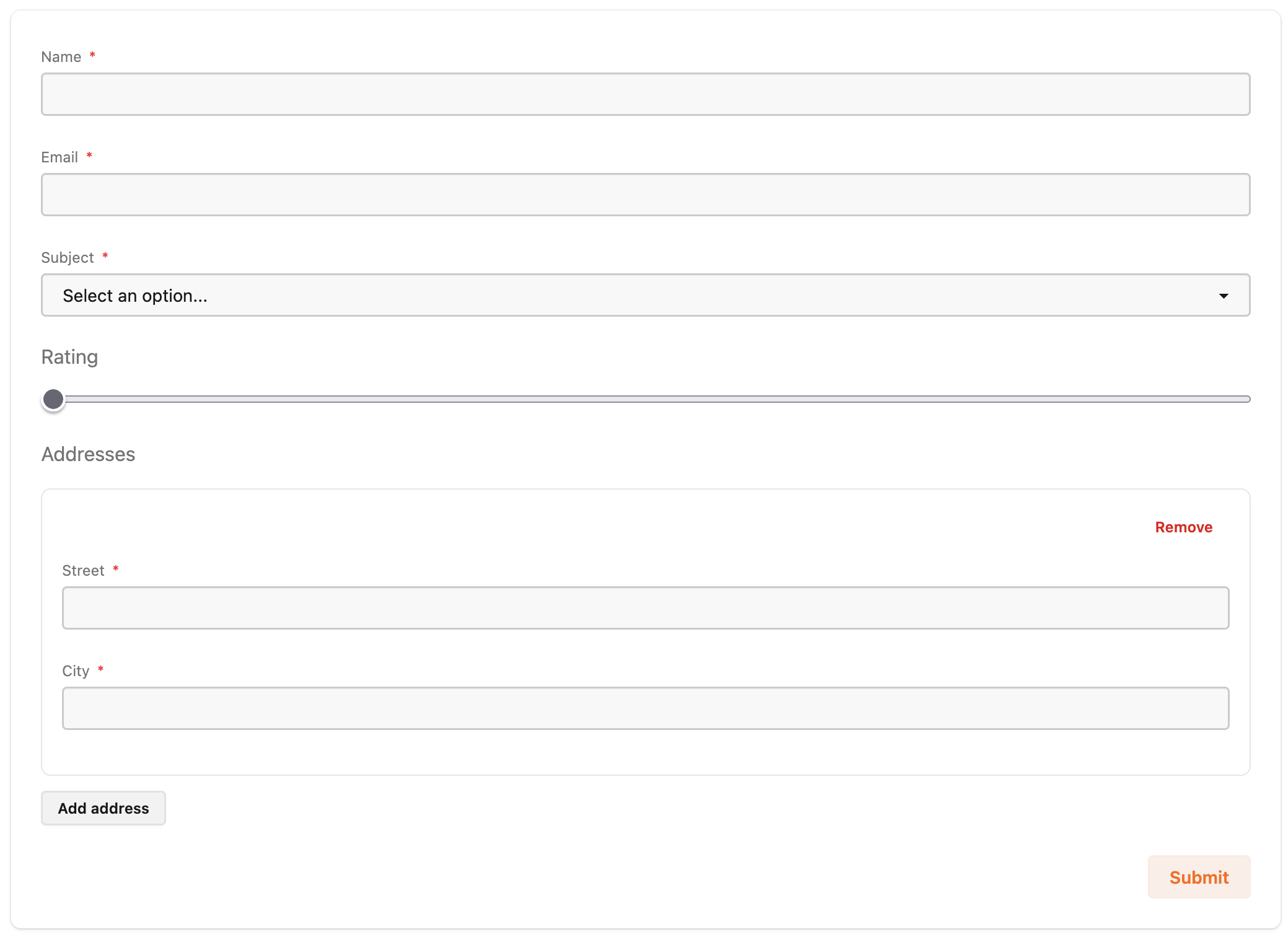
**Nested forms**
Use nested forms to allow users to add multiple records in the same form
The user can add and remove entries. Each entry is validated with its own child
changeset, and the submitted value arrives as a list of maps
(`%{name: "...", addresses: [%{street: "...", city: "..."}, ...]}`):
See the [Nested forms](guides/nested-forms.md) guide for entry seeding,
min/max entry counts, and per-entry validation.
```heex
<:field type="text" name="name" label="Name" min_length={2} required />
<:field type="text" name="email" label="Email" input_type="email" format="email" required />
<:field type="dropdown" name="subject" label="Subject" required options={[{"Support", "support"}, {"Sales", "sales"}]} />
<:field type="comment" name="details" label="Support Details" visible_if="{subject} = 'support'" />
<:field :let={field} type="rating" name="rating" label="Rating">
<:nested name="addresses" title="Addresses" entries={1} add_text="Add address" />
<:field nested="addresses" type="text" name="street" label="Street" required />
<:field nested="addresses" type="text" name="city" label="City" required />
```
**Define forms in data**
Or define the same form as data. SurveyJS-compatible JSON passes straight in
via the `json` attribute (``),
or decode it at the edge — from JSON, a map, or built as structs — and pass
the instance to the same component:
```json
{
"title": "Example Form",
"elements": [
{"type": "text", "name": "name", "inputType": "text"},
{"type": "text", "name": "email", "inputType": "email"}
]
}
```
```heex
```
**Render only**
The library handles events and validations by default. These can be turned off
if you prefer to just use the library as a renderer and to instead handle the
actions yourself using the standard `handle_event` handlers in the LiveView.
Use the `form`, `phx_change`, `phx_submit` and `render_only` attributes to manage
the lifecycle in the LiveView:
```heex
<:field type="text" name="name" label="Name" required />
<:field type="text" name="email" label="Email" input_type="email" format="email" required />
```
```elixir
def mount(_params, _session, socket) do
{:ok, assign(socket, :form, to_form(Contacts.changeset(%{}), as: "contact"))}
end
def handle_event("validate", %{"contact" => _params}, socket) do
{:noreply, socket}
end
def handle_event("save", %{"contact" => _params}, socket) do
{:noreply, socket}
end
```
## Demo app
The `/examples` directory contains a full Phoenix demo app exercising every
feature — declarative and data definitions, every question type, conditional
logic, panels, custom markup, file uploads, and submission handling:
```
git clone https://github.com/chrislaskey/dynamic_form.git
cd dynamic_form/examples/demo
mix setup && iex -S mix phx.server
```
The demo is generated: `examples/regenerate.sh` rebuilds it from a pinned
`phx.new` release, then applies the version-controlled `examples/overlay/`
directory on top. The interesting demo code — LiveViews, form definitions,
layout tweaks — lives in the overlay; edit there, copy over the demo
(`cp -R overlay/. demo/`), and never edit generated files directly.
## Additional documentation
- **[Usage](guides/usage.md)** — every feature in depth: both definition
modes, question types, validation, conditional logic, groups, custom
markup, rendering options, edit mode, submission, and file uploads
- **[Nested forms](guides/nested-forms.md)** — repeating child forms
(SurveyJS `paneldynamic` / `<:nested>` slots): per-entry validation, the
scope model, seeding, and events
- **[SurveyJS compatibility](guides/surveyjs.md)** — defining forms as data:
what's supported, what isn't, and DynamicForm's extensions
- **[Lifecycle events](guides/lifecycle.md)** — the form lifecycle, the
`{:dynamic_form, payload}` message, and the `on_change`/`on_submit`/
`on_success` hooks
- **[Styling](guides/styling.md)** — the default daisyUI styling, custom
components modules, and per-field markup overrides
- **[Reference](guides/reference.md)** — quick tables for every attribute,
slot, question type, validator, and expression operator
- **[Development](guides/development.md)** — the demo app workflow,
architecture notes, and testing
## Installation
DynamicForm is not yet published to Hex. Add it as a path or git dependency
in `mix.exs`:
```elixir
def deps do
[
{:dynamic_form, "~> 0.17"}
]
end
```
### Tailwind CSS
The built-in components use the same markup as `phx.new` 1.8 generates:
Tailwind utility classes plus [daisyUI](https://daisyui.com) component
classes (`input`, `select`, `checkbox`, `radio`, `btn`, `fieldset`, ...).
Phoenix 1.8+ apps vendor daisyUI by default, so the only step is pointing
Tailwind at DynamicForm's source in `assets/css/app.css`:
```css
@source "../../deps/dynamic_form/lib";
```
Apps without daisyUI (Phoenix ≤ 1.7, or apps that removed it) have two
options: vendor daisyUI the way `phx.new` 1.8 does (see the comments in a
freshly generated `assets/css/app.css`), or point the library at your own
components with the `components` attribute/config — your module's markup
then replaces the built-ins entirely. See the
[Styling guide](guides/styling.md) for every customization level.
### File uploads (optional)
Direct-to-cloud file uploads (`type="file"`) require a presigner module and
a JavaScript uploader registered in `assets/js/app.js` — see
[Usage: File uploads](guides/usage.md#file-uploads).
## License
MIT — see [LICENSE.md](LICENSE.md).