Page not found
Sorry, but the page you were trying to get to, does not exist. You may want to try searching this site using the sidebar or using our API Reference page to find what you were looking for.
Sorry, but the page you were trying to get to, does not exist. You may want to try searching this site using the sidebar or using our API Reference page to find what you were looking for.
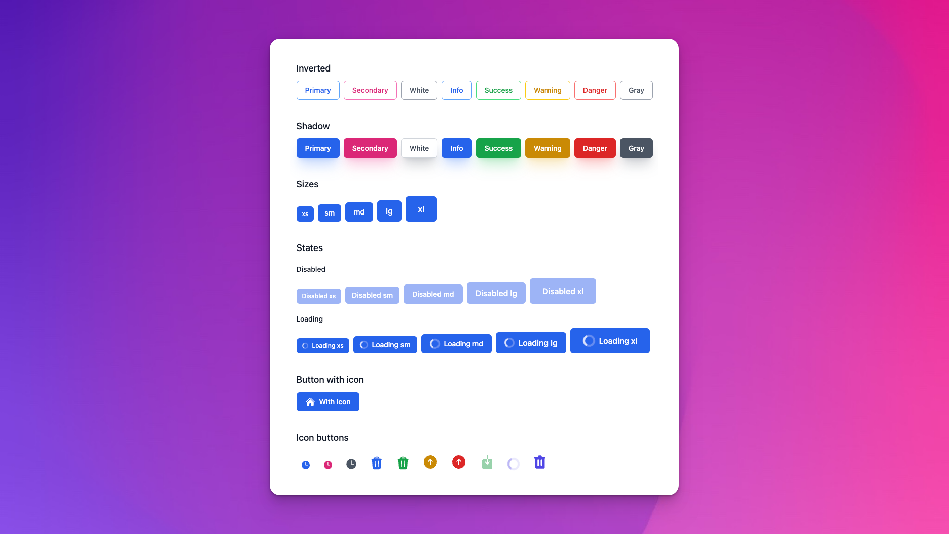
container_id (:string)class (:any) - CSS class for parent container. Defaults to nil.entries (:list) - Defaults to [%{}].variant (:string) - Defaults to "default".js_lib (:string) - JavaScript library used for toggling. Defaults to "alpine_js".open_index (:integer) - Index of item to be open at render. Defaults to nil.item (required) - CSS class for parent container. Accepts attributes:heading (:string)container_id (:string)class (:any) - CSS class for parent container. Defaults to nil.entries (:list) - Defaults to [%{}].variant (:string) - Defaults to "default".js_lib (:string) - JavaScript library used for toggling. Defaults to "alpine_js".open_index (:integer) - Index of item to be open at render. Defaults to nil.item (required) - CSS class for parent container. Accepts attributes:heading (:string)color (:string) - Defaults to "info".variant (:string) - The variant of the alert. Defaults to "light".with_icon (:boolean) - adds some icon base classes. Defaults to false.class (:any) - CSS class for parent div. Defaults to nil.heading (:string) - label your heading. Defaults to nil.label (:string) - label your alert. Defaults to nil.close_button_properties (:list) - a list of properties passed to the close button. Defaults to nil.inner_blockcolor (:string) - Defaults to "info".variant (:string) - The variant of the alert. Defaults to "light".with_icon (:boolean) - adds some icon base classes. Defaults to false.class (:any) - CSS class for parent div. Defaults to nil.heading (:string) - label your heading. Defaults to nil.label (:string) - label your alert. Defaults to nil.close_button_properties (:list) - a list of properties passed to the close button. Defaults to nil.inner_blocksrc (:string) - hosted avatar URL. Defaults to nil.alt (:string) - alt text for avatar image. Defaults to nil.size (:string) - Defaults to "md".class (:any) - CSS class. Defaults to nil.name (:string) - name for placeholder initials. Defaults to nil.random_color (:boolean) - generates a random color for placeholder initials avatar. Defaults to false.size (:string) - Defaults to "md".class (:any) - CSS class. Defaults to nil.avatars (:list) - list of your hosted avatar URLs. Defaults to [].src (:string) - hosted avatar URL. Defaults to nil.alt (:string) - alt text for avatar image. Defaults to nil.size (:string) - Defaults to "md".class (:any) - CSS class. Defaults to nil.name (:string) - name for placeholder initials. Defaults to nil.random_color (:boolean) - generates a random color for placeholder initials avatar. Defaults to false.size (:string) - Defaults to "md".class (:any) - CSS class. Defaults to nil.avatars (:list) - list of your hosted avatar URLs. Defaults to [].size (:string) - Defaults to "md".variant (:string) - Defaults to "light".color (:string) - Defaults to "primary".role (:string) - Defaults to "note".with_icon (:boolean) - adds some icon base classes. Defaults to false.class (:any) - CSS class for parent div. Defaults to nil.label (:string) - label your badge. Defaults to nil.inner_blocksize (:string) - Defaults to "md".variant (:string) - Defaults to "light".color (:string) - Defaults to "primary".role (:string) - Defaults to "note".with_icon (:boolean) - adds some icon base classes. Defaults to false.class (:any) - CSS class for parent div. Defaults to nil.label (:string) - label your badge. Defaults to nil.inner_blockseparator (:string) - Defaults to "slash".class (:any) - Parent div CSS class. Defaults to nil.separator_class (:any) - Separator div CSS class. Defaults to nil.link_class (:any) - Link class CSS. Defaults to nil.links (:list) - List of your links. Defaults to [].aria_label (:string) - ARIA label for the nav. Defaults to "Breadcrumbs".separator (:string) - Defaults to "slash".class (:any) - Parent div CSS class. Defaults to nil.separator_class (:any) - Separator div CSS class. Defaults to nil.link_class (:any) - Link class CSS. Defaults to nil.links (:list) - List of your links. Defaults to [].aria_label (:string) - ARIA label for the nav. Defaults to "Breadcrumbs".size (:string) - button sizes. Defaults to "md".radius (:string) - button border radius. Defaults to "md".variant (:string) - button variant. Defaults to "solid".color (:string) - button color. Defaults to "primary".to (:string) - link path. Defaults to nil.loading (:boolean) - indicates a loading state. Defaults to false.disabled (:boolean) - indicates a disabled state. Defaults to false.icon (:any) - name of a Heroicon at the front of the button. Defaults to nil.with_icon (:boolean) - adds some icon base classes. Defaults to false.link_type (:string) - Defaults to "button".class (:any) - CSS class. Defaults to nil.label (:string) - labels your button. Defaults to nil.["method", "download", "hreflang", "ping", "referrerpolicy", "rel", "target", "type", "value", "name", "form"].inner_blocksize (:string) - Defaults to "sm".color (:string) - Defaults to "gray".radius (:string) - button radius. Defaults to "full".to (:string) - link path. Defaults to nil.loading (:boolean) - indicates a loading state. Defaults to false.disabled (:boolean) - indicates a disabled state. Defaults to false.with_icon (:boolean) - adds some icon base classes. Defaults to false.link_type (:string) - Defaults to "button".class (:any) - CSS class. Defaults to nil.tooltip (:string) - tooltip text. Defaults to nil.["method", "download", "hreflang", "ping", "referrerpolicy", "rel", "target", "type", "value", "name", "form"].inner_blocksize (:string) - button sizes. Defaults to "md".radius (:string) - button border radius. Defaults to "md".variant (:string) - button variant. Defaults to "solid".color (:string) - button color. Defaults to "primary".to (:string) - link path. Defaults to nil.loading (:boolean) - indicates a loading state. Defaults to false.disabled (:boolean) - indicates a disabled state. Defaults to false.icon (:any) - name of a Heroicon at the front of the button. Defaults to nil.with_icon (:boolean) - adds some icon base classes. Defaults to false.link_type (:string) - Defaults to "button".class (:any) - CSS class. Defaults to nil.label (:string) - labels your button. Defaults to nil.["method", "download", "hreflang", "ping", "referrerpolicy", "rel", "target", "type", "value", "name", "form"].inner_blocksize (:string) - Defaults to "sm".color (:string) - Defaults to "gray".radius (:string) - button radius. Defaults to "full".to (:string) - link path. Defaults to nil.loading (:boolean) - indicates a loading state. Defaults to false.disabled (:boolean) - indicates a disabled state. Defaults to false.with_icon (:boolean) - adds some icon base classes. Defaults to false.link_type (:string) - Defaults to "button".class (:any) - CSS class. Defaults to nil.tooltip (:string) - tooltip text. Defaults to nil.["method", "download", "hreflang", "ping", "referrerpolicy", "rel", "target", "type", "value", "name", "form"].inner_blockRenders a button group. Group buttons are configured by defining multiple :button slots.
Renders a button group. Group buttons are configured by defining multiple :button slots.
Note: Phoenix LiveView >= 0.20.17 is required to prevent arbitrary attributes like phx-*
given to :button slots emitting development warnings.
<.button_group aria_label="My actions" size="md">
<:button phx-click="beep" phx-value-boop="bop">Action 1</:button>
<:button phx-click="boop" phx-value-bop="beep">Action 2</:button>
<:button label="Action 3" phx-click="bop" phx-value-beep="boop" disabled={@action_disabled?} />
</.button_group><.button_group aria_label="My links" size="md">
<:button kind="link" patch={~p"/path-one"}>Link 1</:button>
<:button kind="link" patch={~p"/path-two"}>Link 2</:button>
<:button label="Link 3" kind="link" navigate={~p"/other"} />
</.button_group><.button_group
aria_label="Custom styled buttons"
button_bg_class="bg-blue-500 hover:bg-blue-600 dark:bg-blue-700 dark:hover:bg-blue-800 text-white"
button_border_class="border border-blue-300 dark:border-blue-600"
>
<:button>Custom Button 1</:button>
<:button>Custom Button 2</:button>
</.button_group>id (:string) - Defaults to nil.aria_label (:string) (required) - the ARIA label for the button group.size (:string) - Defaults to "md".container_class (:string) - class to apply to the group container. Defaults to "pc-button-group".font_weight_class (:string) - the font weight class to apply to all buttons - defaults to font-medium. Defaults to "font-medium".button_bg_class (:string) - class to customize the button background colors. Defaults to nil.button_border_class (:string) - class to customize the button border styles. Defaults to nil.button (required)class (:any) - CSS class. Defaults to nil.variant (:string) - Defaults to "basic".inner_blockheading (:string) - creates a heading. Defaults to nil.category (:string) - creates a category. Defaults to nil.category_color_class (:any) - sets a category color class. Defaults to "pc-card__category--primary".class (:any) - CSS class. Defaults to nil.inner_blockclass (:any) - CSS class. Defaults to nil.inner_blockaspect_ratio_class (:any) - aspect ratio class. Defaults to "aspect-video".src (:string) - hosted image URL. Defaults to nil.class (:any) - CSS class. Defaults to nil.inner_blockname (:string) (required) - The reviewer's name.username (:string) (required) - The reviewer's username.img (:string) (required) - URL of the reviewer's avatar.body (:string) (required) - The review text content.class (:string) - Additional classes. Defaults to "".class (:any) - CSS class. Defaults to nil.variant (:string) - Defaults to "basic".inner_blockheading (:string) - creates a heading. Defaults to nil.category (:string) - creates a category. Defaults to nil.category_color_class (:any) - sets a category color class. Defaults to "pc-card__category--primary".class (:any) - CSS class. Defaults to nil.inner_blockaspect_ratio_class (:any) - aspect ratio class. Defaults to "aspect-video".src (:string) - hosted image URL. Defaults to nil.class (:any) - CSS class. Defaults to nil.inner_blockname (:string) (required) - The reviewer's name.username (:string) (required) - The reviewer's username.img (:string) (required) - URL of the reviewer's avatar.body (:string) (required) - The review text content.class (:string) - Additional classes. Defaults to "".max_width (:string) - sets container max-width. Defaults to "lg".class (:any) - CSS class for container. Defaults to nil.no_padding_on_mobile (:boolean) - specify for padding on mobile. Defaults to false.inner_block<.dropdown label="Dropdown" js_lib="alpine_js|live_view_js">
to (:string) - link path. Defaults to nil.label (:string) - link label.class (:any) - any additional CSS classes. Defaults to nil.disabled (:boolean) - Defaults to false.link_type (:string) - Defaults to "button".["method", "download", "hreflang", "ping", "referrerpolicy", "rel", "target", "type"].inner_block<.dropdown label="Dropdown" js_lib="alpine_js|live_view_js">
<.dropdown_menu_item link_type="button">
<.icon name="hero-home" class="w-5 h-5 text-gray-500" />
Button item with icon
</.dropdown_menu_item>
<.dropdown_menu_item link_type="a" to="/" label="a item" />
<.dropdown_menu_item link_type="a" to="/" disabled label="disabled item" />
<.dropdown_menu_item link_type="live_patch" to="/" label="Live Patch item" />
<.dropdown_menu_item link_type="live_redirect" to="/" label="Live Redirect item" /></.dropdown>
options_container_id (:string)label (:string) - labels your dropdown option. Defaults to nil.class (:any) - any extra CSS class for the parent container. Defaults to nil.trigger_class (:string) - additional classes for the trigger button. Defaults to nil.menu_items_wrapper_class (:any) - any extra CSS class for menu item wrapper container. Defaults to nil.js_lib (:string) - javascript library used for toggling. Defaults to "alpine_js".placement (:string) - Defaults to "left".trigger_elementinner_blockRenders an input with label and error messages. If you just want an input, check out input.ex
Generates a generic error message.
class (:any) - extra classes for the help text. Defaults to nil.help_text (:string) - context/help for your field. Defaults to nil.inner_blockRenders a label.
class (:any) - Defaults to nil.errors (:list) - Defaults to [].name (:string)no_margin (:boolean) - removes the margin from the field wrapper. Defaults to false.inner_block (required)Renders an input with label and error messages. If you just want an input, check out input.ex
A %Phoenix.HTML.FormField{} and type may be passed to the field
to build input names and error messages, or all the attributes and
errors may be passed explicitly.
<.field field={@form[:email]} type="email" />
<.field label="Name" value="" name="name" errors={["oh no!"]} />id (:any) - the id of the input. If not passed, it will be generated automatically from the field. Defaults to nil.name (:any) - the name of the input. If not passed, it will be generated automatically from the field.label (:string) - the label for the input. If not passed, it will be generated automatically from the field.value (:any) - the value of the input. If not passed, it will be generated automatically from the field.type (:string) - the type of input. Defaults to "text".size (:string) - the size of the switch (xs, sm, md, lg or xl) or radio card (sm, md or lg). Defaults to "md".variant (:any) - outline, classic - used by radio-card. Defaults to "outline".viewable (:boolean) - If true, adds a toggle to show/hide the password text. Defaults to false.copyable (:boolean) - If true, adds a copy button to the field and disables the input. Defaults to false.clearable (:boolean) - If true, adds a clear button to clear the field value. Defaults to false.no_margin (:boolean) - removes the margin from the field wrapper. Defaults to false.field (Phoenix.HTML.FormField) - a form field struct retrieved from the form, for example: @form[:email].errors (:list) - a list of errors to display. If not passed, it will be generated automatically from the field. Format is a list of strings. Defaults to [].checked (:any) - the checked flag for checkboxes and checkbox groups.prompt (:string) - the prompt for select inputs. Defaults to nil.options (:list) - the options to pass to Phoenix.HTML.Form.options_for_select/2.multiple (:boolean) - the multiple flag for select inputs. Defaults to false.disabled_options (:list) - the options to disable in a checkbox group. Defaults to [].group_layout (:string) - the layout of the inputs in a group (checkbox-group or radio-group). Defaults to "row".empty_message (:string) - the message to display when there are no options available, for checkbox-group or radio-group. Defaults to nil.rows (:string) - rows for textarea. Defaults to "4".class (:any) - the class to add to the input. Defaults to nil.wrapper_class (:any) - the wrapper div classes. Defaults to nil.help_text (:string) - context/help for your field. Defaults to nil.label_class (:any) - extra CSS for your label. Defaults to nil.selected (:any) - the selected value for select inputs. Defaults to nil.required (:boolean) - is this field required? is passed to the input and adds an asterisk next to the label. Defaults to false.["autocomplete", "autocorrect", "autocapitalize", "disabled", "form", "max", "maxlength", "min", "minlength", "list", "pattern", "placeholder", "readonly", "required", "size", "step", "value", "name", "multiple", "prompt", "default", "year", "month", "day", "hour", "minute", "second", "builder", "options", "layout", "cols", "rows", "wrap", "checked", "accept"].Generates a generic error message.
inner_block (required)class (:any) - extra classes for the help text. Defaults to nil.help_text (:string) - context/help for your field. Defaults to nil.inner_blockRenders a label.
for (:string) - Defaults to nil.class (:any) - Defaults to nil.required (:boolean) - Defaults to false.inner_block (required)class (:any) - Defaults to nil.errors (:list) - Defaults to [].name (:string)no_margin (:boolean) - removes the margin from the field wrapper. Defaults to false.inner_block (required)Everything related to forms: inputs, labels etc
Deprecated in favor of field.ex and input.ex, which use the new %Phoenix.HTML.FormField{} struct.
form (:any) - . Defaults to nil.field (:atom) - . Defaults to nil.label (:string) - labels your field. Defaults to nil.class (:any) - extra classes for the text input. Defaults to nil.["checked_value", "unchecked_value", "checked", "hidden_input", "autocomplete", "autocorrect", "autocapitalize", "disabled", "form", "max", "maxlength", "min", "minlength", "list", "pattern", "placeholder", "readonly", "required", "size", "step", "value", "name", "multiple", "prompt", "selected", "default", "year", "month", "day", "hour", "minute", "second", "builder", "options", "layout", "cols", "rows", "wrap", "checked", "accept"].form (:any) - . Defaults to nil.field (:atom) - . Defaults to nil.label (:string) - labels your field. Defaults to nil.class (:any) - extra classes for the text input. Defaults to nil.options (:list) - options for the select. Defaults to [].layout (:atom) - layout for the checkboxes. Defaults to :col.checked (:list) - a list of checked values.["autocomplete", "autocorrect", "autocapitalize", "disabled", "form", "max", "maxlength", "min", "minlength", "list", "pattern", "placeholder", "readonly", "required", "size", "step", "value", "name", "multiple", "prompt", "selected", "default", "year", "month", "day", "hour", "minute", "second", "builder", "options", "layout", "cols", "rows", "wrap", "checked", "accept"].form (:any) - . Defaults to nil.field (:atom) - . Defaults to nil.label (:string) - labels your field. Defaults to nil.class (:any) - extra classes for the text input. Defaults to nil.["autocomplete", "autocorrect", "autocapitalize", "disabled", "form", "max", "maxlength", "min", "minlength", "list", "pattern", "placeholder", "readonly", "required", "size", "step", "value", "name", "multiple", "prompt", "selected", "default", "year", "month", "day", "hour", "minute", "second", "builder", "options", "layout", "cols", "rows", "wrap", "checked", "accept"].form (:any) - . Defaults to nil.field (:atom) - . Defaults to nil.label (:string) - labels your field. Defaults to nil.class (:any) - extra classes for the text input. Defaults to nil.["autocomplete", "autocorrect", "autocapitalize", "disabled", "form", "max", "maxlength", "min", "minlength", "list", "pattern", "placeholder", "readonly", "required", "size", "step", "value", "name", "multiple", "prompt", "selected", "default", "year", "month", "day", "hour", "minute", "second", "builder", "options", "layout", "cols", "rows", "wrap", "checked", "accept"].form (:any) - . Defaults to nil.field (:atom) - . Defaults to nil.label (:string) - labels your field. Defaults to nil.class (:any) - extra classes for the text input. Defaults to nil.["autocomplete", "autocorrect", "autocapitalize", "disabled", "form", "max", "maxlength", "min", "minlength", "list", "pattern", "placeholder", "readonly", "required", "size", "step", "value", "name", "multiple", "prompt", "selected", "default", "year", "month", "day", "hour", "minute", "second", "builder", "options", "layout", "cols", "rows", "wrap", "checked", "accept"].form (:any) - . Defaults to nil.field (:atom) - . Defaults to nil.label (:string) - labels your field. Defaults to nil.class (:any) - extra classes for the text input. Defaults to nil.["autocomplete", "autocorrect", "autocapitalize", "disabled", "form", "max", "maxlength", "min", "minlength", "list", "pattern", "placeholder", "readonly", "required", "size", "step", "value", "name", "multiple", "prompt", "selected", "default", "year", "month", "day", "hour", "minute", "second", "builder", "options", "layout", "cols", "rows", "wrap", "checked", "accept"].form (:any) - . Defaults to nil.field (:atom) - . Defaults to nil.label (:string) - labels your field. Defaults to nil.class (:any) - extra classes for the text input. Defaults to nil.["autocomplete", "autocorrect", "autocapitalize", "disabled", "form", "max", "maxlength", "min", "minlength", "list", "pattern", "placeholder", "readonly", "required", "size", "step", "value", "name", "multiple", "prompt", "selected", "default", "year", "month", "day", "hour", "minute", "second", "builder", "options", "layout", "cols", "rows", "wrap", "checked", "accept"].form (:any) - . Defaults to nil.field (:atom) - . Defaults to nil.label (:string) - labels your field. Defaults to nil.class (:any) - extra classes for the text input. Defaults to nil.["autocomplete", "autocorrect", "autocapitalize", "disabled", "form", "max", "maxlength", "min", "minlength", "list", "pattern", "placeholder", "readonly", "required", "size", "step", "value", "name", "multiple", "prompt", "selected", "default", "year", "month", "day", "hour", "minute", "second", "builder", "options", "layout", "cols", "rows", "wrap", "checked", "accept"].form (:any) - . Defaults to nil.field (:atom) - . Defaults to nil.label (:string) - labels your field. Defaults to nil.class (:any) - extra classes for the text input. Defaults to nil.["autocomplete", "autocorrect", "autocapitalize", "disabled", "form", "max", "maxlength", "min", "minlength", "list", "pattern", "placeholder", "readonly", "required", "size", "step", "value", "name", "multiple", "prompt", "selected", "default", "year", "month", "day", "hour", "minute", "second", "builder", "options", "layout", "cols", "rows", "wrap", "checked", "accept"].Use this when you want to include the label and some margin.
form (:any) - . Defaults to nil.field (:atom) - . Defaults to nil.class (:any) - extra classes for the text input. Defaults to nil.class (:any) - extra classes for the help text. Defaults to nil.help_text (:string) - context/help for your field. Defaults to nil.inner_blockform (:any) - . Defaults to nil.field (:atom) - . Defaults to nil.label (:string) - labels your field. Defaults to nil.class (:any) - CSS classes to add to your label.compound (:boolean) - Avoid using label/for for compound inputs. Defaults to false.["for"].inner_blockform (:any) - . Defaults to nil.field (:atom) - . Defaults to nil.["autocomplete", "autocorrect", "autocapitalize", "disabled", "form", "max", "maxlength", "min", "minlength", "list", "pattern", "placeholder", "readonly", "required", "size", "step", "value", "name", "multiple", "prompt", "selected", "default", "year", "month", "day", "hour", "minute", "second", "builder", "options", "layout", "cols", "rows", "wrap", "checked", "accept"].form (:any) - . Defaults to nil.field (:atom) - . Defaults to nil.label (:string) - labels your field. Defaults to nil.class (:any) - extra classes for the text input. Defaults to nil.["autocomplete", "autocorrect", "autocapitalize", "disabled", "form", "max", "maxlength", "min", "minlength", "list", "pattern", "placeholder", "readonly", "required", "size", "step", "value", "name", "multiple", "prompt", "selected", "default", "year", "month", "day", "hour", "minute", "second", "builder", "options", "layout", "cols", "rows", "wrap", "checked", "accept"].form (:any) - . Defaults to nil.field (:atom) - . Defaults to nil.label (:string) - labels your field. Defaults to nil.class (:any) - extra classes for the text input. Defaults to nil.["autocomplete", "autocorrect", "autocapitalize", "disabled", "form", "max", "maxlength", "min", "minlength", "list", "pattern", "placeholder", "readonly", "required", "size", "step", "value", "name", "multiple", "prompt", "selected", "default", "year", "month", "day", "hour", "minute", "second", "builder", "options", "layout", "cols", "rows", "wrap", "checked", "accept"].form (:any) - . Defaults to nil.field (:atom) - . Defaults to nil.label (:string) - labels your field. Defaults to nil.class (:any) - extra classes for the text input. Defaults to nil.value (:any) - the radio value. Defaults to nil.["autocomplete", "autocorrect", "autocapitalize", "disabled", "form", "max", "maxlength", "min", "minlength", "list", "pattern", "placeholder", "readonly", "required", "size", "step", "value", "name", "multiple", "prompt", "selected", "default", "year", "month", "day", "hour", "minute", "second", "builder", "options", "layout", "cols", "rows", "wrap", "checked", "accept"].form (:any) - . Defaults to nil.field (:atom) - . Defaults to nil.label (:string) - labels your field. Defaults to nil.class (:any) - extra classes for the text input. Defaults to nil.options (:list) - options for the select. Defaults to [].layout (:atom) - layout for the radio options. Defaults to :col.["autocomplete", "autocorrect", "autocapitalize", "disabled", "form", "max", "maxlength", "min", "minlength", "list", "pattern", "placeholder", "readonly", "required", "size", "step", "value", "name", "multiple", "prompt", "selected", "default", "year", "month", "day", "hour", "minute", "second", "builder", "options", "layout", "cols", "rows", "wrap", "checked", "accept"].form (:any) - . Defaults to nil.field (:atom) - . Defaults to nil.label (:string) - labels your field. Defaults to nil.class (:any) - extra classes for the text input. Defaults to nil.["autocomplete", "autocorrect", "autocapitalize", "disabled", "form", "max", "maxlength", "min", "minlength", "list", "pattern", "placeholder", "readonly", "required", "size", "step", "value", "name", "multiple", "prompt", "selected", "default", "year", "month", "day", "hour", "minute", "second", "builder", "options", "layout", "cols", "rows", "wrap", "checked", "accept"].form (:any) - . Defaults to nil.field (:atom) - . Defaults to nil.label (:string) - labels your field. Defaults to nil.class (:any) - extra classes for the text input. Defaults to nil.["autocomplete", "autocorrect", "autocapitalize", "disabled", "form", "max", "maxlength", "min", "minlength", "list", "pattern", "placeholder", "readonly", "required", "size", "step", "value", "name", "multiple", "prompt", "selected", "default", "year", "month", "day", "hour", "minute", "second", "builder", "options", "layout", "cols", "rows", "wrap", "checked", "accept"].form (:any) - . Defaults to nil.field (:atom) - . Defaults to nil.label (:string) - labels your field. Defaults to nil.class (:any) - extra classes for the text input. Defaults to nil.options (:list) - options for the select. Defaults to [].["autocomplete", "autocorrect", "autocapitalize", "disabled", "form", "max", "maxlength", "min", "minlength", "list", "pattern", "placeholder", "readonly", "required", "size", "step", "value", "name", "multiple", "prompt", "selected", "default", "year", "month", "day", "hour", "minute", "second", "builder", "options", "layout", "cols", "rows", "wrap", "checked", "accept"].form (:any) - . Defaults to nil.field (:atom) - . Defaults to nil.label (:string) - labels your field. Defaults to nil.class (:any) - extra classes for the text input. Defaults to nil.size (:string) - the size of the switch. Defaults to "md".["checked_value", "unchecked_value", "checked", "hidden_input", "autocomplete", "autocorrect", "autocapitalize", "disabled", "form", "max", "maxlength", "min", "minlength", "list", "pattern", "placeholder", "readonly", "required", "size", "step", "value", "name", "multiple", "prompt", "selected", "default", "year", "month", "day", "hour", "minute", "second", "builder", "options", "layout", "cols", "rows", "wrap", "checked", "accept"].form (:any) - . Defaults to nil.field (:atom) - . Defaults to nil.label (:string) - labels your field. Defaults to nil.class (:any) - extra classes for the text input. Defaults to nil.["autocomplete", "autocorrect", "autocapitalize", "disabled", "form", "max", "maxlength", "min", "minlength", "list", "pattern", "placeholder", "readonly", "required", "size", "step", "value", "name", "multiple", "prompt", "selected", "default", "year", "month", "day", "hour", "minute", "second", "builder", "options", "layout", "cols", "rows", "wrap", "checked", "accept"].form (:any) - . Defaults to nil.field (:atom) - . Defaults to nil.label (:string) - labels your field. Defaults to nil.class (:any) - extra classes for the text input. Defaults to nil.["autocomplete", "autocorrect", "autocapitalize", "disabled", "form", "max", "maxlength", "min", "minlength", "list", "pattern", "placeholder", "readonly", "required", "size", "step", "value", "name", "multiple", "prompt", "selected", "default", "year", "month", "day", "hour", "minute", "second", "builder", "options", "layout", "cols", "rows", "wrap", "checked", "accept"].form (:any) - . Defaults to nil.field (:atom) - . Defaults to nil.label (:string) - labels your field. Defaults to nil.class (:any) - extra classes for the text input. Defaults to nil.["autocomplete", "autocorrect", "autocapitalize", "disabled", "form", "max", "maxlength", "min", "minlength", "list", "pattern", "placeholder", "readonly", "required", "size", "step", "value", "name", "multiple", "prompt", "selected", "default", "year", "month", "day", "hour", "minute", "second", "builder", "options", "layout", "cols", "rows", "wrap", "checked", "accept"].form (:any) - . Defaults to nil.field (:atom) - . Defaults to nil.label (:string) - labels your field. Defaults to nil.class (:any) - extra classes for the text input. Defaults to nil.["autocomplete", "autocorrect", "autocapitalize", "disabled", "form", "max", "maxlength", "min", "minlength", "list", "pattern", "placeholder", "readonly", "required", "size", "step", "value", "name", "multiple", "prompt", "selected", "default", "year", "month", "day", "hour", "minute", "second", "builder", "options", "layout", "cols", "rows", "wrap", "checked", "accept"].form (:any) - . Defaults to nil.field (:atom) - . Defaults to nil.label (:string) - labels your field. Defaults to nil.class (:any) - extra classes for the text input. Defaults to nil.["autocomplete", "autocorrect", "autocapitalize", "disabled", "form", "max", "maxlength", "min", "minlength", "list", "pattern", "placeholder", "readonly", "required", "size", "step", "value", "name", "multiple", "prompt", "selected", "default", "year", "month", "day", "hour", "minute", "second", "builder", "options", "layout", "cols", "rows", "wrap", "checked", "accept"].form (:any) - . Defaults to nil.field (:atom) - . Defaults to nil.label (:string) - labels your field. Defaults to nil.class (:any) - extra classes for the text input. Defaults to nil.["autocomplete", "autocorrect", "autocapitalize", "disabled", "form", "max", "maxlength", "min", "minlength", "list", "pattern", "placeholder", "readonly", "required", "size", "step", "value", "name", "multiple", "prompt", "selected", "default", "year", "month", "day", "hour", "minute", "second", "builder", "options", "layout", "cols", "rows", "wrap", "checked", "accept"].form (:any) - . Defaults to nil.field (:atom) - . Defaults to nil.label (:string) - labels your field. Defaults to nil.class (:any) - extra classes for the text input. Defaults to nil.["checked_value", "unchecked_value", "checked", "hidden_input", "autocomplete", "autocorrect", "autocapitalize", "disabled", "form", "max", "maxlength", "min", "minlength", "list", "pattern", "placeholder", "readonly", "required", "size", "step", "value", "name", "multiple", "prompt", "selected", "default", "year", "month", "day", "hour", "minute", "second", "builder", "options", "layout", "cols", "rows", "wrap", "checked", "accept"].form (:any) - . Defaults to nil.field (:atom) - . Defaults to nil.label (:string) - labels your field. Defaults to nil.class (:any) - extra classes for the text input. Defaults to nil.options (:list) - options for the select. Defaults to [].layout (:atom) - layout for the checkboxes. Defaults to :col.checked (:list) - a list of checked values.["autocomplete", "autocorrect", "autocapitalize", "disabled", "form", "max", "maxlength", "min", "minlength", "list", "pattern", "placeholder", "readonly", "required", "size", "step", "value", "name", "multiple", "prompt", "selected", "default", "year", "month", "day", "hour", "minute", "second", "builder", "options", "layout", "cols", "rows", "wrap", "checked", "accept"].form (:any) - . Defaults to nil.field (:atom) - . Defaults to nil.label (:string) - labels your field. Defaults to nil.class (:any) - extra classes for the text input. Defaults to nil.["autocomplete", "autocorrect", "autocapitalize", "disabled", "form", "max", "maxlength", "min", "minlength", "list", "pattern", "placeholder", "readonly", "required", "size", "step", "value", "name", "multiple", "prompt", "selected", "default", "year", "month", "day", "hour", "minute", "second", "builder", "options", "layout", "cols", "rows", "wrap", "checked", "accept"].form (:any) - . Defaults to nil.field (:atom) - . Defaults to nil.label (:string) - labels your field. Defaults to nil.class (:any) - extra classes for the text input. Defaults to nil.["autocomplete", "autocorrect", "autocapitalize", "disabled", "form", "max", "maxlength", "min", "minlength", "list", "pattern", "placeholder", "readonly", "required", "size", "step", "value", "name", "multiple", "prompt", "selected", "default", "year", "month", "day", "hour", "minute", "second", "builder", "options", "layout", "cols", "rows", "wrap", "checked", "accept"].form (:any) - . Defaults to nil.field (:atom) - . Defaults to nil.label (:string) - labels your field. Defaults to nil.class (:any) - extra classes for the text input. Defaults to nil.["autocomplete", "autocorrect", "autocapitalize", "disabled", "form", "max", "maxlength", "min", "minlength", "list", "pattern", "placeholder", "readonly", "required", "size", "step", "value", "name", "multiple", "prompt", "selected", "default", "year", "month", "day", "hour", "minute", "second", "builder", "options", "layout", "cols", "rows", "wrap", "checked", "accept"].form (:any) - . Defaults to nil.field (:atom) - . Defaults to nil.label (:string) - labels your field. Defaults to nil.class (:any) - extra classes for the text input. Defaults to nil.["autocomplete", "autocorrect", "autocapitalize", "disabled", "form", "max", "maxlength", "min", "minlength", "list", "pattern", "placeholder", "readonly", "required", "size", "step", "value", "name", "multiple", "prompt", "selected", "default", "year", "month", "day", "hour", "minute", "second", "builder", "options", "layout", "cols", "rows", "wrap", "checked", "accept"].form (:any) - . Defaults to nil.field (:atom) - . Defaults to nil.label (:string) - labels your field. Defaults to nil.class (:any) - extra classes for the text input. Defaults to nil.["autocomplete", "autocorrect", "autocapitalize", "disabled", "form", "max", "maxlength", "min", "minlength", "list", "pattern", "placeholder", "readonly", "required", "size", "step", "value", "name", "multiple", "prompt", "selected", "default", "year", "month", "day", "hour", "minute", "second", "builder", "options", "layout", "cols", "rows", "wrap", "checked", "accept"].form (:any) - . Defaults to nil.field (:atom) - . Defaults to nil.label (:string) - labels your field. Defaults to nil.class (:any) - extra classes for the text input. Defaults to nil.["autocomplete", "autocorrect", "autocapitalize", "disabled", "form", "max", "maxlength", "min", "minlength", "list", "pattern", "placeholder", "readonly", "required", "size", "step", "value", "name", "multiple", "prompt", "selected", "default", "year", "month", "day", "hour", "minute", "second", "builder", "options", "layout", "cols", "rows", "wrap", "checked", "accept"].form (:any) - . Defaults to nil.field (:atom) - . Defaults to nil.label (:string) - labels your field. Defaults to nil.class (:any) - extra classes for the text input. Defaults to nil.["autocomplete", "autocorrect", "autocapitalize", "disabled", "form", "max", "maxlength", "min", "minlength", "list", "pattern", "placeholder", "readonly", "required", "size", "step", "value", "name", "multiple", "prompt", "selected", "default", "year", "month", "day", "hour", "minute", "second", "builder", "options", "layout", "cols", "rows", "wrap", "checked", "accept"].Use this when you want to include the label and some margin.
form (:any) (required) - the form object.field (:atom) (required) - field in changeset / form.label (:string) - labels your field.label_class (:any) - extra CSS for your label. Defaults to nil.help_text (:string) - context/help for your field. Defaults to nil.type (:string) - The type of input. Defaults to "text_input".wrapper_classes (:string) - CSS class for wrapper. Defaults to "pc-form-field-wrapper".no_margin (:boolean) - removes the bottom margin from the field wrapper. Defaults to false.["autocomplete", "autocorrect", "autocapitalize", "disabled", "form", "max", "maxlength", "min", "minlength", "list", "pattern", "placeholder", "readonly", "required", "size", "step", "value", "name", "multiple", "prompt", "selected", "default", "year", "month", "day", "hour", "minute", "second", "builder", "options", "layout", "cols", "rows", "wrap", "checked", "accept"].form (:any) - . Defaults to nil.field (:atom) - . Defaults to nil.class (:any) - extra classes for the text input. Defaults to nil.class (:any) - extra classes for the help text. Defaults to nil.help_text (:string) - context/help for your field. Defaults to nil.inner_blockform (:any) - . Defaults to nil.field (:atom) - . Defaults to nil.label (:string) - labels your field. Defaults to nil.class (:any) - CSS classes to add to your label.compound (:boolean) - Avoid using label/for for compound inputs. Defaults to false.["for"].inner_blockform (:any) - . Defaults to nil.field (:atom) - . Defaults to nil.label (:string) - labels your field. Defaults to nil.class (:any) - extra classes for the text input. Defaults to nil.["autocomplete", "autocorrect", "autocapitalize", "disabled", "form", "max", "maxlength", "min", "minlength", "list", "pattern", "placeholder", "readonly", "required", "size", "step", "value", "name", "multiple", "prompt", "selected", "default", "year", "month", "day", "hour", "minute", "second", "builder", "options", "layout", "cols", "rows", "wrap", "checked", "accept"].form (:any) - . Defaults to nil.field (:atom) - . Defaults to nil.label (:string) - labels your field. Defaults to nil.class (:any) - extra classes for the text input. Defaults to nil.["autocomplete", "autocorrect", "autocapitalize", "disabled", "form", "max", "maxlength", "min", "minlength", "list", "pattern", "placeholder", "readonly", "required", "size", "step", "value", "name", "multiple", "prompt", "selected", "default", "year", "month", "day", "hour", "minute", "second", "builder", "options", "layout", "cols", "rows", "wrap", "checked", "accept"].form (:any) - . Defaults to nil.field (:atom) - . Defaults to nil.label (:string) - labels your field. Defaults to nil.class (:any) - extra classes for the text input. Defaults to nil.value (:any) - the radio value. Defaults to nil.["autocomplete", "autocorrect", "autocapitalize", "disabled", "form", "max", "maxlength", "min", "minlength", "list", "pattern", "placeholder", "readonly", "required", "size", "step", "value", "name", "multiple", "prompt", "selected", "default", "year", "month", "day", "hour", "minute", "second", "builder", "options", "layout", "cols", "rows", "wrap", "checked", "accept"].form (:any) - . Defaults to nil.field (:atom) - . Defaults to nil.label (:string) - labels your field. Defaults to nil.class (:any) - extra classes for the text input. Defaults to nil.options (:list) - options for the select. Defaults to [].layout (:atom) - layout for the radio options. Defaults to :col.["autocomplete", "autocorrect", "autocapitalize", "disabled", "form", "max", "maxlength", "min", "minlength", "list", "pattern", "placeholder", "readonly", "required", "size", "step", "value", "name", "multiple", "prompt", "selected", "default", "year", "month", "day", "hour", "minute", "second", "builder", "options", "layout", "cols", "rows", "wrap", "checked", "accept"].form (:any) - . Defaults to nil.field (:atom) - . Defaults to nil.label (:string) - labels your field. Defaults to nil.class (:any) - extra classes for the text input. Defaults to nil.["autocomplete", "autocorrect", "autocapitalize", "disabled", "form", "max", "maxlength", "min", "minlength", "list", "pattern", "placeholder", "readonly", "required", "size", "step", "value", "name", "multiple", "prompt", "selected", "default", "year", "month", "day", "hour", "minute", "second", "builder", "options", "layout", "cols", "rows", "wrap", "checked", "accept"].form (:any) - . Defaults to nil.field (:atom) - . Defaults to nil.label (:string) - labels your field. Defaults to nil.class (:any) - extra classes for the text input. Defaults to nil.["autocomplete", "autocorrect", "autocapitalize", "disabled", "form", "max", "maxlength", "min", "minlength", "list", "pattern", "placeholder", "readonly", "required", "size", "step", "value", "name", "multiple", "prompt", "selected", "default", "year", "month", "day", "hour", "minute", "second", "builder", "options", "layout", "cols", "rows", "wrap", "checked", "accept"].form (:any) - . Defaults to nil.field (:atom) - . Defaults to nil.label (:string) - labels your field. Defaults to nil.class (:any) - extra classes for the text input. Defaults to nil.options (:list) - options for the select. Defaults to [].["autocomplete", "autocorrect", "autocapitalize", "disabled", "form", "max", "maxlength", "min", "minlength", "list", "pattern", "placeholder", "readonly", "required", "size", "step", "value", "name", "multiple", "prompt", "selected", "default", "year", "month", "day", "hour", "minute", "second", "builder", "options", "layout", "cols", "rows", "wrap", "checked", "accept"].form (:any) - . Defaults to nil.field (:atom) - . Defaults to nil.label (:string) - labels your field. Defaults to nil.class (:any) - extra classes for the text input. Defaults to nil.size (:string) - the size of the switch. Defaults to "md".["checked_value", "unchecked_value", "checked", "hidden_input", "autocomplete", "autocorrect", "autocapitalize", "disabled", "form", "max", "maxlength", "min", "minlength", "list", "pattern", "placeholder", "readonly", "required", "size", "step", "value", "name", "multiple", "prompt", "selected", "default", "year", "month", "day", "hour", "minute", "second", "builder", "options", "layout", "cols", "rows", "wrap", "checked", "accept"].form (:any) - . Defaults to nil.field (:atom) - . Defaults to nil.label (:string) - labels your field. Defaults to nil.class (:any) - extra classes for the text input. Defaults to nil.["autocomplete", "autocorrect", "autocapitalize", "disabled", "form", "max", "maxlength", "min", "minlength", "list", "pattern", "placeholder", "readonly", "required", "size", "step", "value", "name", "multiple", "prompt", "selected", "default", "year", "month", "day", "hour", "minute", "second", "builder", "options", "layout", "cols", "rows", "wrap", "checked", "accept"].form (:any) - . Defaults to nil.field (:atom) - . Defaults to nil.label (:string) - labels your field. Defaults to nil.class (:any) - extra classes for the text input. Defaults to nil.["autocomplete", "autocorrect", "autocapitalize", "disabled", "form", "max", "maxlength", "min", "minlength", "list", "pattern", "placeholder", "readonly", "required", "size", "step", "value", "name", "multiple", "prompt", "selected", "default", "year", "month", "day", "hour", "minute", "second", "builder", "options", "layout", "cols", "rows", "wrap", "checked", "accept"].form (:any) - . Defaults to nil.field (:atom) - . Defaults to nil.label (:string) - labels your field. Defaults to nil.class (:any) - extra classes for the text input. Defaults to nil.["autocomplete", "autocorrect", "autocapitalize", "disabled", "form", "max", "maxlength", "min", "minlength", "list", "pattern", "placeholder", "readonly", "required", "size", "step", "value", "name", "multiple", "prompt", "selected", "default", "year", "month", "day", "hour", "minute", "second", "builder", "options", "layout", "cols", "rows", "wrap", "checked", "accept"].form (:any) - . Defaults to nil.field (:atom) - . Defaults to nil.label (:string) - labels your field. Defaults to nil.class (:any) - extra classes for the text input. Defaults to nil.["autocomplete", "autocorrect", "autocapitalize", "disabled", "form", "max", "maxlength", "min", "minlength", "list", "pattern", "placeholder", "readonly", "required", "size", "step", "value", "name", "multiple", "prompt", "selected", "default", "year", "month", "day", "hour", "minute", "second", "builder", "options", "layout", "cols", "rows", "wrap", "checked", "accept"].form (:any) - . Defaults to nil.field (:atom) - . Defaults to nil.label (:string) - labels your field. Defaults to nil.class (:any) - extra classes for the text input. Defaults to nil.["autocomplete", "autocorrect", "autocapitalize", "disabled", "form", "max", "maxlength", "min", "minlength", "list", "pattern", "placeholder", "readonly", "required", "size", "step", "value", "name", "multiple", "prompt", "selected", "default", "year", "month", "day", "hour", "minute", "second", "builder", "options", "layout", "cols", "rows", "wrap", "checked", "accept"].form (:any) - . Defaults to nil.field (:atom) - . Defaults to nil.label (:string) - labels your field. Defaults to nil.class (:any) - extra classes for the text input. Defaults to nil.["autocomplete", "autocorrect", "autocapitalize", "disabled", "form", "max", "maxlength", "min", "minlength", "list", "pattern", "placeholder", "readonly", "required", "size", "step", "value", "name", "multiple", "prompt", "selected", "default", "year", "month", "day", "hour", "minute", "second", "builder", "options", "layout", "cols", "rows", "wrap", "checked", "accept"].For any helper functions used across multiple components. Ideally we keep this empty - components should be copy-pastable.
Generates a unique HTML ID based on the given string or iodata.
Generates a unique HTML ID based on the given string or iodata.
iex> PetalComponents.Helpers.uniq_id("My Heading")
"c-my-heading-1234"
iex> PetalComponents.Helpers.uniq_id(["My ", {:safe, "<a>Link</a>"}, " Label"], "custom")
"custom-my-link-label-5678"Icon name can be the function or passed in as a type eg.
<PetalComponents.HeroiconsV1.Solid.home class="w-5 h-5" />
<PetalComponents.HeroiconsV1.Solid.home title="Optional title for accessibility" class="w-5 h-5" />
<PetalComponents.HeroiconsV1.Solid.render icon="home" class="w-5 h-5" />
<PetalComponents.HeroiconsV1.Outline.home class="w-6 h-6" />
<PetalComponents.HeroiconsV1.Outline.home title="Optional title for accessibility" class="w-6 h-6" />
<PetalComponents.HeroiconsV1.Outline.render icon="home" class="w-6 h-6" />Icon name can be the function or passed in as a type eg.
<PetalComponents.HeroiconsV1.Solid.home class="w-5 h-5" />
<PetalComponents.HeroiconsV1.Solid.home title="Optional title for accessibility" class="w-5 h-5" />
<PetalComponents.HeroiconsV1.Solid.render icon="home" class="w-5 h-5" />
<PetalComponents.HeroiconsV1.Outline.home class="w-6 h-6" />
<PetalComponents.HeroiconsV1.Outline.home title="Optional title for accessibility" class="w-6 h-6" />
<PetalComponents.HeroiconsV1.Outline.render icon="home" class="w-6 h-6" />Renders pure inputs (no label or errors).
id (:any) - Defaults to nil.name (:any)label (:string)value (:any)type (:string) - Defaults to "text".size (:string) - the size of the switch. Defaults to "md".viewable (:boolean) - If true, adds a toggle to show/hide the password text. Defaults to false.copyable (:boolean) - If true, adds a copy button to the field and disables the input. Defaults to false.clearable (:boolean) - If true, adds a clear button to clear the field value. Defaults to false.field (Phoenix.HTML.FormField) - a form field struct retrieved from the form, for example: @form[:email].checked (:boolean) - the checked flag for checkbox inputs.prompt (:string) - the prompt for select inputs. Defaults to nil.options (:list) - the options to pass to Phoenix.HTML.Form.options_for_select/2.multiple (:boolean) - the multiple flag for select inputs. Defaults to false.class (:any) - the class to add to the input. Defaults to nil.["autocomplete", "autocorrect", "autocapitalize", "disabled", "form", "max", "maxlength", "min", "minlength", "list", "pattern", "placeholder", "readonly", "required", "size", "step", "value", "name", "multiple", "prompt", "selected", "default", "year", "month", "day", "hour", "minute", "second", "builder", "options", "layout", "cols", "rows", "wrap", "checked", "accept"].id (:any) - Defaults to nil.name (:any)label (:string)value (:any)type (:string) - Defaults to "text".size (:string) - the size of the switch. Defaults to "md".viewable (:boolean) - If true, adds a toggle to show/hide the password text. Defaults to false.copyable (:boolean) - If true, adds a copy button to the field and disables the input. Defaults to false.clearable (:boolean) - If true, adds a clear button to clear the field value. Defaults to false.field (Phoenix.HTML.FormField) - a form field struct retrieved from the form, for example: @form[:email].checked (:boolean) - the checked flag for checkbox inputs.prompt (:string) - the prompt for select inputs. Defaults to nil.options (:list) - the options to pass to Phoenix.HTML.Form.options_for_select/2.multiple (:boolean) - the multiple flag for select inputs. Defaults to false.class (:any) - the class to add to the input. Defaults to nil.["autocomplete", "autocorrect", "autocapitalize", "disabled", "form", "max", "maxlength", "min", "minlength", "list", "pattern", "placeholder", "readonly", "required", "size", "step", "value", "name", "multiple", "prompt", "selected", "default", "year", "month", "day", "hour", "minute", "second", "builder", "options", "layout", "cols", "rows", "wrap", "checked", "accept"].class (:any) - CSS class for link (either a string or list). Defaults to nil.link_type (:string) - Defaults to "a".label (:string) - label your link. Defaults to nil.to (:string) - link path. Defaults to nil.disabled (:boolean) - disables the link. This will turn an <a> into a <button> (<a> tags can't be disabled). Defaults to false.["method", "download"].inner_blockclass (:any) - CSS class for link (either a string or list). Defaults to nil.link_type (:string) - Defaults to "a".label (:string) - label your link. Defaults to nil.to (:string) - link path. Defaults to nil.disabled (:boolean) - disables the link. This will turn an <a> into a <button> (<a> tags can't be disabled). Defaults to false.["method", "download"].inner_blocksize (:string) - Defaults to "sm".size_class (:any) - custom CSS classes for size. eg: h-4 w-4. Defaults to nil.class (:any) - CSS class. Defaults to nil.show (:boolean) - show or hide spinner. Defaults to true.pause_on_hover (:boolean) - Pause the marquee when the user hovers over the cards. Defaults to false.repeat (:integer) - Number of times to repeat the content. Defaults to 4.vertical (:boolean) - Display the marquee vertically. Defaults to false.reverse (:boolean) - Reverse the direction of the marquee. Defaults to false.duration (:string) - Animation duration. Defaults to "30s".gap (:string) - Gap between items. Defaults to "1rem".overlay_gradient (:boolean) - Add gradient overlay at edges. Defaults to true.max_width (:string) - Maximum width of the marquee container. Defaults to "none".max_height (:string) - Maximum height of the marquee container. Defaults to "none".class (:string) - CSS class for parent div. Defaults to "".inner_block (required)pause_on_hover (:boolean) - Pause the marquee when the user hovers over the cards. Defaults to false.repeat (:integer) - Number of times to repeat the content. Defaults to 4.vertical (:boolean) - Display the marquee vertically. Defaults to false.reverse (:boolean) - Reverse the direction of the marquee. Defaults to false.duration (:string) - Animation duration. Defaults to "30s".gap (:string) - Gap between items. Defaults to "1rem".overlay_gradient (:boolean) - Add gradient overlay at edges. Defaults to true.max_width (:string) - Maximum width of the marquee container. Defaults to "none".max_height (:string) - Maximum height of the marquee container. Defaults to "none".class (:string) - CSS class for parent div. Defaults to "".inner_block (required)current_page (:atom)menu_items (:list)title (:string)js_lib (:string) - javascript library used for toggling. Defaults to "alpine_js".Menu items (main_menu_items + user_menu_items) should have this structure
current_page (:atom)path (:string) - Defaults to nil.icon (:any) - Defaults to nil.label (:string)name (:atom) - Defaults to nil.menu_items (:list) - Defaults to nil.all_menu_items (:list) - Defaults to nil.patch_group (:atom) - Defaults to nil.link_type (:string) - Defaults to "live_redirect".js_lib (:string) - javascript library used for toggling. Defaults to "alpine_js".id (:string) - modal id. Defaults to "modal".hide (:boolean) - modal is hidden. Defaults to false.title (:string) - modal title. Defaults to nil.class (:any) - modal class. Defaults to nil.close_modal_target (:string) - close_modal_target allows you to target a specific live component for the close event to go to. eg: close_modal_target={@myself}. Defaults to nil.close_on_click_away (:boolean) - whether the modal should close when a user clicks away. Defaults to true.close_on_escape (:boolean) - whether the modal should close when a user hits escape. Defaults to true.hide_close_button (:boolean) - whether or not the modal should have a close button in the header. Defaults to false.on_cancel (Phoenix.LiveView.JS) - a JS function to execute when the modal is closed. Defaults to pushing close_modal event. Defaults to %Phoenix.LiveView.JS{ops: [["exec", %{attr: "data-cancel-default"}]]}.max_width (:string) - modal max width. Defaults to "md".inner_blockid (:string) - modal id. Defaults to "modal".hide (:boolean) - modal is hidden. Defaults to false.title (:string) - modal title. Defaults to nil.class (:any) - modal class. Defaults to nil.close_modal_target (:string) - close_modal_target allows you to target a specific live component for the close event to go to. eg: close_modal_target={@myself}. Defaults to nil.close_on_click_away (:boolean) - whether the modal should close when a user clicks away. Defaults to true.close_on_escape (:boolean) - whether the modal should close when a user hits escape. Defaults to true.hide_close_button (:boolean) - whether or not the modal should have a close button in the header. Defaults to false.on_cancel (Phoenix.LiveView.JS) - a JS function to execute when the modal is closed. Defaults to pushing close_modal event. Defaults to %Phoenix.LiveView.JS{ops: [["exec", %{attr: "data-cancel-default"}]]}.max_width (:string) - modal max width. Defaults to "md".inner_blockPagination is the method of splitting up content into discrete pages. It specifies the total number of pages and inidicates to a user the current page within the context of total pages.
In the path param you can specify :page as the place your page number will appear.
e.g "/posts/:page" => "/posts/1"
In the path param you can specify :page as the place your page number will appear.
e.g "/posts/:page" => "/posts/1"
path (:string) - page path. Defaults to "/:page".class (:any) - parent div CSS class. Defaults to nil.link_type (:string) - Defaults to "a".event (:boolean) - whether to use phx-click events instead of linking. Enabling this will disable link_type and path. Defaults to false.target (:any) - the LiveView/LiveComponent to send the event to. Example: @myself. Will be ignored if event is not enabled. Defaults to nil.total_pages (:integer) - sets a total page count. Defaults to nil.current_page (:integer) - sets the current page. Defaults to nil.sibling_count (:integer) - sets a sibling count. Defaults to 1.boundary_count (:integer) - sets a boundary count. Defaults to 1.show_boundary_chevrons (:boolean) - whether to show prev & next buttons at boundary pages. Defaults to false.get_items computes the pagination button information based on
get_items computes the pagination button information based on
As this control receives user input, possibly from the internet a reasonable result is computed despite invalid input values and at least one page item is returned always.
:enabled? false if page 1 is current:enabled? false if the last page is currentplease see the unit tests for examples
size (:string) - Defaults to "md".color (:string) - Defaults to "primary".label (:string) - labels your progress bar [xl only]. Defaults to nil.value (:integer) - adds a value to your progress bar. Defaults to nil.max (:integer) - sets a max value for your progress bar. Defaults to 100.class (:any) - CSS class. Defaults to nil.size (:string) - Defaults to "md".color (:string) - Defaults to "primary".label (:string) - labels your progress bar [xl only]. Defaults to nil.value (:integer) - adds a value to your progress bar. Defaults to nil.max (:integer) - sets a max value for your progress bar. Defaults to 100.class (:any) - CSS class. Defaults to nil.rating (:any) - The rating to display (integer or float). Defaults to 0.round_to_nearest_half (:boolean) - Whether to round the rating to the nearest half star (eg. 3.3 -> 3.5. Defaults to true.total (:integer) - The total number of stars to display. Defaults to 5.class (:any) - Any additional CSS classes for the rating wrapper. Defaults to nil.star_class (:any) - Any additional CSS classes for the individual stars. Eg. you could change the size of the stars with 'h-10 w-10'. Defaults to nil.include_label (:boolean) - Whether to include an automatically generated rating label. Defaults to false.label_class (:any) - Any additional CSS classes for the rating label. Defaults to nil.class (:any) - Any additional CSS classes for the star. Defaults to nil.type (:atom) - The type of star to display. Defaults to :empty.rating (:any) - The rating to display (integer or float). Defaults to 0.round_to_nearest_half (:boolean) - Whether to round the rating to the nearest half star (eg. 3.3 -> 3.5. Defaults to true.total (:integer) - The total number of stars to display. Defaults to 5.class (:any) - Any additional CSS classes for the rating wrapper. Defaults to nil.star_class (:any) - Any additional CSS classes for the individual stars. Eg. you could change the size of the stars with 'h-10 w-10'. Defaults to nil.include_label (:boolean) - Whether to include an automatically generated rating label. Defaults to false.label_class (:any) - Any additional CSS classes for the rating label. Defaults to nil.class (:any) - Any additional CSS classes for the star. Defaults to nil.type (:atom) - The type of star to display. Defaults to :empty.kind (:atom) - skeleton. Defaults to :default.id (:string) - Defaults to "slide-over".origin (:string) - slideover point of origin. Defaults to "right".close_slide_over_target (:string) - close_slide_over_target allows you to target a specific live component for the close event to go to. eg: close_slide_over_target={@myself}. Defaults to nil.close_on_click_away (:boolean) - whether the slideover should close when a user clicks away. Defaults to true.close_on_escape (:boolean) - whether the slideover should close when a user hits escape. Defaults to true.title (:string) - slideover title. Defaults to nil.max_width (:string) - sets container max-width. Defaults to "md".class (:any) - CSS class. Defaults to nil.hide (:boolean) - slideover is hidden. Defaults to false.inner_blockid (:string) - Defaults to "slide-over".origin (:string) - slideover point of origin. Defaults to "right".close_slide_over_target (:string) - close_slide_over_target allows you to target a specific live component for the close event to go to. eg: close_slide_over_target={@myself}. Defaults to nil.close_on_click_away (:boolean) - whether the slideover should close when a user clicks away. Defaults to true.close_on_escape (:boolean) - whether the slideover should close when a user hits escape. Defaults to true.title (:string) - slideover title. Defaults to nil.max_width (:string) - sets container max-width. Defaults to "md".class (:any) - CSS class. Defaults to nil.hide (:boolean) - slideover is hidden. Defaults to false.inner_blocksteps (:list) (required)orientation (:string) - Defaults to "horizontal".size (:string) - Defaults to "md".class (:string) - Defaults to "".Renders a table with generic styling.
class (:any) - CSS class. Defaults to nil.["colspan", "headers", "rowspan"].inner_blockclass (:any) - CSS class. Defaults to nil.["colspan", "rowspan"].inner_blockclass (:any) - CSS class. Defaults to nil.inner_blockclass (:any) - CSS class. Defaults to nil.label (:string) - Adds a label your user, e.g name. Defaults to nil.sub_label (:string) - Adds a sub-label your to your user, e.g title. Defaults to nil.avatar_assigns (:map) - if using an avatar, this map will be passed to the avatar component as props. Defaults to nil.Renders a table with generic styling.
<.table id="users" rows={@users}>
<:col :let={user} label="id"><%= user.id %></:col>
<:col :let={user} label="username"><%= user.username %></:col>
<:empty_state>No data here yet</:empty_state>
</.table>id (:string)class (:any) - CSS class. Defaults to nil.variant (:string) - Defaults to "basic".rows (:list) - the list of rows to render. Defaults to [].row_id (:any) - the function for generating the row id. Defaults to nil.row_click (:any) - the function for handling phx-click on each row. Defaults to nil.row_item (:any) - the function for mapping each row before calling the :col slot. Defaults to &Function.identity/1.["colspan", "rowspan"].col - Accepts attributes:label (:string)class (:any)row_class (:any)empty_state - A message to show when the table is empty, to be used together with :col. Accepts attributes:row_class (:any)class (:any) - CSS class. Defaults to nil.["colspan", "headers", "rowspan"].inner_blockclass (:any) - CSS class. Defaults to nil.["colspan", "rowspan"].inner_blockclass (:any) - CSS class. Defaults to nil.inner_blockclass (:any) - CSS class. Defaults to nil.label (:string) - Adds a label your user, e.g name. Defaults to nil.sub_label (:string) - Adds a sub-label your to your user, e.g title. Defaults to nil.avatar_assigns (:map) - if using an avatar, this map will be passed to the avatar component as props. Defaults to nil.class (:any) - CSS class. Defaults to nil.label (:string) - labels your tab. Defaults to nil.link_type (:string) - Defaults to "a".to (:string) - link path. Defaults to nil.number (:integer) - indicates a number next to your tab. Defaults to nil.underline (:boolean) - underlines your tab. Defaults to false.is_active (:boolean) - indicates the current tab. Defaults to false.disabled (:boolean) - disables your tab. Defaults to false.["method", "download", "hreflang", "ping", "referrerpolicy", "rel", "target", "type"].inner_blockunderline (:boolean) - underlines your tabs. Defaults to false.class (:any) - CSS class. Defaults to nil.inner_blockclass (:any) - CSS class. Defaults to nil.label (:string) - labels your tab. Defaults to nil.link_type (:string) - Defaults to "a".to (:string) - link path. Defaults to nil.number (:integer) - indicates a number next to your tab. Defaults to nil.underline (:boolean) - underlines your tab. Defaults to false.is_active (:boolean) - indicates the current tab. Defaults to false.disabled (:boolean) - disables your tab. Defaults to false.["method", "download", "hreflang", "ping", "referrerpolicy", "rel", "target", "type"].inner_blockunderline (:boolean) - underlines your tabs. Defaults to false.class (:any) - CSS class. Defaults to nil.inner_blockEverything related to text. Headings, paragraphs and links
class (:any) - CSS class. Defaults to nil.label (:string) - label your heading. Defaults to nil.no_margin (:boolean) - removes margin from headings. Defaults to nil.underline (:boolean) - underlines a heading. Defaults to false.color_class (:any) - adds a color class. Defaults to nil.inner_blockclass (:any) - CSS class. Defaults to nil.label (:string) - label your heading. Defaults to nil.no_margin (:boolean) - removes margin from headings. Defaults to nil.underline (:boolean) - underlines a heading. Defaults to false.color_class (:any) - adds a color class. Defaults to nil.inner_blockclass (:any) - CSS class. Defaults to nil.label (:string) - label your heading. Defaults to nil.no_margin (:boolean) - removes margin from headings. Defaults to nil.underline (:boolean) - underlines a heading. Defaults to false.color_class (:any) - adds a color class. Defaults to nil.inner_blockclass (:any) - CSS class. Defaults to nil.label (:string) - label your heading. Defaults to nil.no_margin (:boolean) - removes margin from headings. Defaults to nil.underline (:boolean) - underlines a heading. Defaults to false.color_class (:any) - adds a color class. Defaults to nil.inner_blockclass (:any) - CSS class. Defaults to nil.label (:string) - label your heading. Defaults to nil.no_margin (:boolean) - removes margin from headings. Defaults to nil.underline (:boolean) - underlines a heading. Defaults to false.color_class (:any) - adds a color class. Defaults to nil.inner_blockUsage
class (:any) - CSS class. Defaults to nil.no_margin (:boolean) - removes margin from paragraph. Defaults to nil.inner_blockclass (:any) - CSS class. Defaults to nil.inner_blockUsage
class (:any) - CSS class. Defaults to nil.label (:string) - label your heading. Defaults to nil.no_margin (:boolean) - removes margin from headings. Defaults to nil.underline (:boolean) - underlines a heading. Defaults to false.color_class (:any) - adds a color class. Defaults to nil.inner_blockclass (:any) - CSS class. Defaults to nil.label (:string) - label your heading. Defaults to nil.no_margin (:boolean) - removes margin from headings. Defaults to nil.underline (:boolean) - underlines a heading. Defaults to false.color_class (:any) - adds a color class. Defaults to nil.inner_blockclass (:any) - CSS class. Defaults to nil.label (:string) - label your heading. Defaults to nil.no_margin (:boolean) - removes margin from headings. Defaults to nil.underline (:boolean) - underlines a heading. Defaults to false.color_class (:any) - adds a color class. Defaults to nil.inner_blockclass (:any) - CSS class. Defaults to nil.label (:string) - label your heading. Defaults to nil.no_margin (:boolean) - removes margin from headings. Defaults to nil.underline (:boolean) - underlines a heading. Defaults to false.color_class (:any) - adds a color class. Defaults to nil.inner_blockclass (:any) - CSS class. Defaults to nil.label (:string) - label your heading. Defaults to nil.no_margin (:boolean) - removes margin from headings. Defaults to nil.underline (:boolean) - underlines a heading. Defaults to false.color_class (:any) - adds a color class. Defaults to nil.inner_blockUsage:
<.ol>
<li>Item 1</li>
<li>Item 2</li>
</.ol>class (:any) - CSS class. Defaults to nil.inner_blockclass (:any) - CSS class. Defaults to nil.no_margin (:boolean) - removes margin from paragraph. Defaults to nil.inner_blockclass (:any) - CSS class. Defaults to nil.inner_blockUsage:
<.ul>
<li>Item 1</li>
<li>Item 2</li>
</.ul>class (:any) - CSS class. Defaults to nil.inner_blockuser_menu_items (:list) - list of maps with keys :path, :icon (atom), :label, :method (atom - optional).current_user_name (:string) - the current signed in user's name.avatar_src (:string) - the current signed in user's avatar image src. Defaults to nil.A LiveView to test the accessibility of Petal Components using :a11y_audit.
It's worth noting that this view is ugly because classes defined with @apply are not able to be processed for Phoenix Playground at this time (as far as I can tell).
To run locally: $ iex -S mix iex> Run.playground()
Callback implementation for Phoenix.LiveView.mount/3.
Callback implementation for Phoenix.LiveView.render/1.
Callback implementation for Phoenix.LiveView.mount/3.
Callback implementation for Phoenix.LiveView.render/1.
Everything related to forms: inputs, labels etc
For any helper functions used across multiple components. Ideally we keep this empty - components should be copy-pastable.
Icon name can be the function or passed in as a type eg.
Icon name can be the function or passed in as a type eg.
Renders pure inputs (no label or errors).
Pagination is the method of splitting up content into discrete pages. It specifies the total number of pages and inidicates to a user the current page within the context of total pages.
SVG helper components.
Everything related to text. Headings, paragraphs and links
A LiveView to test the accessibility of Petal Components using :a11y_audit.
'+((s=t.lambda(e,e))!=null?s:"")+`
`},9:function(t,e,n,r,i){var s,o=t.lookupProperty||function(a,l){if(Object.prototype.hasOwnProperty.call(a,l))return a[l]};return((s=(o(n,"isArray")||e&&o(e,"isArray")||t.hooks.helperMissing).call(e??(t.nullContext||{}),e!=null?o(e,"results"):e,{name:"isArray",hash:{},fn:t.program(10,i,0),inverse:t.program(12,i,0),data:i,loc:{start:{line:23,column:2},end:{line:29,column:14}}}))!=null?s:"")+`The search functionality is full-text based. Here are some tips:
foo bar) are searched as OR* anywhere (such as fo*) as wildcard+ before a word (such as +foo) to make its presence required- before a word (such as -foo) to make its absence required: to search on a particular field (such as field:word). The available fields are title, doc and typeWORD^NUMBER (such as foo^2) to boost the given wordWORD~NUMBER (such as foo~2) to do a search with edit distance on wordTo quickly go to a module, type, or function, use the autocompletion feature in the sidebar search.
`},10:function(t,e,n,r,i){var s,o=t.lookupProperty||function(a,l){if(Object.prototype.hasOwnProperty.call(a,l))return a[l]};return"Sorry, we couldn't find anything for "+t.escapeExpression((s=(s=o(n,"value")||(e!=null?o(e,"value"):e))!=null?s:t.hooks.helperMissing,typeof s=="function"?s.call(e??(t.nullContext||{}),{name:"value",hash:{},data:i,loc:{start:{line:24,column:48},end:{line:24,column:57}}}):s))+`.
`},12:function(t,e,n,r,i){var s,o=t.lookupProperty||function(a,l){if(Object.prototype.hasOwnProperty.call(a,l))return a[l]};return(s=o(n,"if").call(e??(t.nullContext||{}),e!=null?o(e,"value"):e,{name:"if",hash:{},fn:t.program(13,i,0),inverse:t.program(15,i,0),data:i,loc:{start:{line:25,column:2},end:{line:29,column:2}}}))!=null?s:""},13:function(t,e,n,r,i){var s,o=t.lookupProperty||function(a,l){if(Object.prototype.hasOwnProperty.call(a,l))return a[l]};return"Invalid search: "+t.escapeExpression((s=(s=o(n,"errorMessage")||(e!=null?o(e,"errorMessage"):e))!=null?s:t.hooks.helperMissing,typeof s=="function"?s.call(e??(t.nullContext||{}),{name:"errorMessage",hash:{},data:i,loc:{start:{line:26,column:23},end:{line:26,column:39}}}):s))+`.
`},15:function(t,e,n,r,i){return`Please type something into the search bar to perform a search.
`},compiler:[8,">= 4.3.0"],main:function(t,e,n,r,i){var s,o=e??(t.nullContext||{}),a=t.lookupProperty||function(l,u){if(Object.prototype.hasOwnProperty.call(l,u))return l[u]};return` 
Petal is a set of HEEX components that makes it easy for Phoenix developers to build beautiful web apps. Think Bootstrap or MUI, but written in HEEX using Tailwind CSS classes. Work in both live and dead (controller) views.


Petal stands for:
Some components like Dropdowns require Javascript to work. We default to Alpine JS (17kb) but you can choose to use Phoenix.LiveView.JS as an alternative (though this will only work in live environments like live views or live components).
For full documentation, visit petal.build.
We have a fresh Phoenix boilerplate template with Petal Components ready to go if you would like to get your hands dirty.
Install our VSCode extension to gain access to 65+ snippets for all of the components.
We’ve released an official Figma UI kit for Petal. This kit includes all the open source and pro components you need to design your app in Figma.
Q: Do I need Alpine JS? A: No we have designed the components to use either Alpine JS or LiveView.JS.
Q: What if I want to use my own components too? A: You can install this library and import only the components you need.
# The recommended option is to import every single component
use PetalComponents
# But you can get more granular. eg.
# Import Button so you can now create `<.button>` components
import PetalComponents.Button
# Or just alias if you already have a `def button` HEEX component. With alias you now write the Petal component like this: `<Button.button>`
alias PetalComponents.ButtonQ: Does this increase my CSS filesize?
A: Tailwind will scan any folders you specify and hoover up CSS classes from files to include in your final CSS file. You specify the folders in assets/app.css. By default, we instruct you to just scan the whole Petal Components library:
@import "tailwindcss";
@source "../deps/petal_components/**/*.*ex";
@import "../deps/petal_components/assets/default.css";
... rest of file omittedYou might be worried that if you don't use every component you'll have unused CSS classes. But we believe it's so small it won't matter. Our petal.build site's CSS file totals just 25kb.
If you really want to you can instruct Tailwind to just scan the components you use:
@source "../deps/petal_components/lib/button.ex",
@source "../deps/petal_components/lib/alert.ex",Q: Can I customize the components? A: Yes! You can customize the components by overriding the CSS classes. For example, if you want to change the color of the button you can do this:
@layer components {
.pc-button {
@apply inline-flex items-center justify-center font-semibold tracking-wider uppercase transition duration-150 ease-in-out border-2 rounded-none focus:outline-hidden;
}
.pc-button--primary {
@apply text-black border-black bg-primary-400 hover:bg-primary-700 focus:bg-primary-700 active:bg-primary-800 focus:shadow-primary-500/50;
}
}If you have a suggestion for a new component, you can add it here on our roadmap.
If you'd like to help out we've got a Phoenix umbrella app that allows you to easily contribute to Petal Components (which is installed as a git submodule). If you create a new component then feel free to submit a PR. Ideally one from the roadmap but we're open to any new components that would benefit others!
Looking to talk Petal with fellow devs? Join our great community over at our discord. For regular updates, consider signing up to petal.build and if you have any questions feel free to reach out to us at support@petal.build.