Page not found
Sorry, but the page you were trying to get to, does not exist. You may want to try searching this site using the sidebar or using our API Reference page to find what you were looking for.
Sorry, but the page you were trying to get to, does not exist. You may want to try searching this site using the sidebar or using our API Reference page to find what you were looking for.
LiveSelect.ChangeMsg
Message sent by LiveSelect components in response to text entered by the user in the text input field
Message sent by LiveSelect components in response to text entered by the user in the text input field
The module that implements the LiveSelect live component
Callback implementation for Phoenix.LiveComponent.render/1.
Callback implementation for Phoenix.LiveComponent.render/1.
The LiveSelect component is rendered by calling the live_select/3 function and passing it a form and the name of the field.
LiveSelect creates a text input field in which the user can type text, and hidden input field(s) that will contain the value of the selected option(s).
As the input text changes, LiveSelect will render a dropdown below the text input containing the matching options, which the user can then select.
Selection can happen either using the keyboard, by navigating the options with the arrow keys and then pressing enter, or by clicking an option with the mouse.
Whenever an option is selected, LiveSelect will trigger a standard phx-change event in the form. See the "Examples" section
below for details on how to handle the event.
In single mode, if the configuration option allow_clear is set, the user can manually clear the selection by clicking on the x button on the input field.
In tags mode, single tags can be removed by clicking on them.
single-mode
Single mode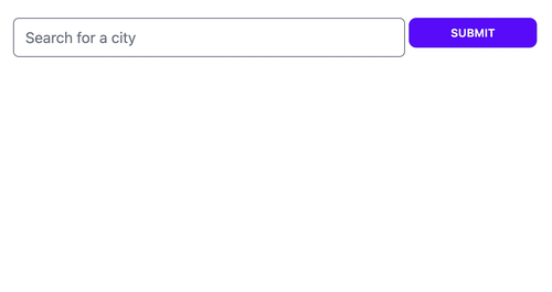
tags-mode
Tags mode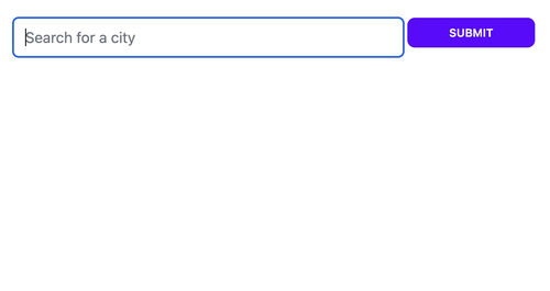
options
OptionsYou can pass or update the list of options the user can choose from with the options assign.
Each option will be assigned a label, which will be shown in the dropdown, and a value, which will be the value of the
LiveSelect input when the option is selected.
options can be any enumeration of the following elements:
{label, value} corresponding to label and value for the option%{label: label, value: value} or %{value: value} [label: label, value: value] or [value: value]In the case of maps and keywords, if only value is specified, it will be used as both value and label for the option.
Because you can pass a list of tuples, you can use maps and keyword lists to pass the list of options, for example:
%{Red: 1, Yellow: 2, Green: 3}Will result in 3 options with labels :Red, :Yellow, :Green and values 1, 2, and 3.
Note that the option values, if they are not strings, will be JSON-encoded. Your LiveView will receive this JSON-encoded version in the phx-change and phx-submit events.
alternative-tag-labels
Alternative tag labelsSometimes, in :tags mode, you might want to use alternative labels for the tags. For example, you might want the labels in the tags to be shorter
in order to save space. You can do this by specifying an additional tag_label key when passing options as map or keywords. For example, passing these options:
[%{label: "New York", tag_label: "NY"}, %{label: "Barcelona", tag_label: "BCN"}] will result in "New York" and "Barcelona" being used for the options in the dropdown, while "NY" and "BCN" will be used for the tags.
reacting-to-user-s-input
Reacting to user's inputWhenever the user types something in the text input, LiveSelect sends a LiveSelect.ChangeMsg.t/0 message to your LiveView.
The message has a text property containing the current text entered by the user, as well as id and field properties with the id of the
LiveSelect component and the name of the LiveSelect form field, respectively.
The LiveView's job is to handle_info/2 the message and then call LiveView.send_update/3
to update the list of selectable options. See the "Examples" section below for details.
multiple-selection-with-tags-mode
Multiple selection with tags modeWhen :tags mode is enabled LiveSelect allows the user to select multiple entries. The entries will be visible above the text input field as removable tags.
The selected entries will be passed to your live view's change and submit event handlers as a list of entries, just like an HTML <select> element with multiple attribute would do.
clearing-the-selection-programmatically
Clearing the selection programmaticallyYou can clear the selection programmatically by sending a clear: true assign to LiveSelect
send_update(LiveSelect.Component, id: live_select_id, clear: true)To set a custom id for the component, use the id option when calling live_select/3.
examples
ExamplesThese examples describe all the moving parts in detail. You can see these examples in action, see which messages and events are being sent, and play around with the configuration easily with the showcase app.
single-mode-1
Single modeThe user can search for cities.
The LiveSelect main form input is called city_search.
When a city is selected, the coordinates of that city will be the value of the form input.
The name of the selected city is available in the text input field named city_search_text_input.
Template:
<.form for={:my_form} :let={f} phx-change="change">
<%= live_select f, :city_search %>
</.form>LiveView:
import LiveSelect
@impl true
def handle_info(%LiveSelect.ChangeMsg{} = change_msg, socket) do
cities = City.search(change_msg.text)
# cities could be:
# [ {"city name 1", [lat_1, long_1]}, {"city name 2", [lat_2, long_2]}, ... ]
#
# but it could also be (no coordinates in this case):
# [ "city name 1", "city name 2", ... ]
#
# or:
# [ [label: "city name 1", value: [lat_1, long_1]], [label: "city name 2", value: [lat_2, long_2]], ... ]
#
# or even:
# ["city name 1": [lat_1, long_1], "city name 2": [lat_2, long_2]]
send_update(LiveSelect.Component, id: change_msg.id, options: cities)
{:noreply, socket}
end
@impl true
def handle_event(
"change",
%{"my_form" => %{"city_search_text_input" => city_name, "city_search" => city_coords}},
socket
) do
IO.puts("You selected city #{city_name} located at: #{city_coords}")
{:noreply, socket}
end tags-mode-1
Tags modeLet's say you want to build on the previous example and allow the user to select multiple cities and not only one.
The :tags mode allows you to do exactly this.
Template:
<.form for={:my_form} :let={f} phx-change="change">
<%= live_select f, :city_search, mode: :tags %>
</.form>LiveView:
@impl true
def handle_event(
"change",
%{"my_form" => %{"city_search" => list_of_coords}},
socket
) do
# list_of_coords will contain the list of the JSON-encoded coordinates of the selected cities, for example:
# ["[-46.565,-23.69389]", "[-48.27722,-18.91861]"]
IO.puts("You selected cities located at: #{list_of_coords}")
{:noreply, socket}
end multiple-liveselect-inputs-in-the-same-liveview
Multiple LiveSelect inputs in the same LiveViewIf you have multiple LiveSelect inputs in the same LiveView, you can distinguish them based on the field or id. For example:
Template:
<.form for={:my_form} :let={f} phx-change="change">
<%= live_select f, :city_search %>
<%= live_select f, :album_search %>
</.form>LiveView:
@impl true
def handle_info(%LiveSelect.ChangeMsg{} = change_msg, socket) do
options =
case change_msg.field do
:city_search -> City.search(change_msg.text)
:album_search -> Album.search(change_msg.text)
end
send_update(LiveSelect.Component, id: change_msg.id, options: options)
{:noreply, socket}
endRenders a LiveSelect input in a form with a given field name.
Updates a LiveSelect component with new options. change_msg must be the LiveSelect.ChangeMsg.t/0 originally sent by the LiveSelect,
and options is the new list of options that will be used to fill the dropdown.
Renders a LiveSelect input in a form with a given field name.
LiveSelect renders two inputs: a hidden input (of type either text or select, depending on the specified mode) named field that holds the value of the selected option(s),
and a visible text input field named #{field}_text_input that contains the text entered by the user.
Opts:
id - an id to assign to the component. If none is provided, #{form_name}_#{field_name}_component will be usedmode - either :single (for single selection, the default), or :tags (for multiple selection using tags) options - initial available options to select from. See the "Options" section for details on what you can pass herevalue - used to manually set an initial selection - overrides any values from the form.
Must be a single element in :single mode, or a list of elements in :tags mode.
If an element can be found in the initial options, the corresponding label will be used. Otherwise, the element will be used for both value and labelmax_selectable - limits the maximum number of selectable elements. Defaults to 0, meaning no limituser_defined_options - if true, hitting enter will always add the text entered by the user to the selection. Defaults to false allow_clear - if true, when in single mode, display a "x" button in the input field to clear the selectiondisabled - set this to true to disable the input fieldplaceholder - placeholder text for the input field debounce - number of milliseconds to wait after the last keystroke before sending a LiveSelect.ChangeMsg.t/0 message. Defaults to 100msupdate_min_len - the minimum length of text in the text input field that will trigger an update of the dropdown. It has to be a positive integer. Defaults to 3style - one of :tailwind (the default), :daisyui or :none. See the Styling section for detailsactive_option_class, available_option_class, container_class, container_extra_class, dropdown_class, dropdown_extra_class, option_class, option_extra_class, text_input_class, text_input_extra_class, text_input_selected_class,selected_option_class, tag_class, tag_extra_class, tags_container_class, tags_container_extra_class - see the Styling section for detailsUpdates a LiveSelect component with new options. change_msg must be the LiveSelect.ChangeMsg.t/0 originally sent by the LiveSelect,
and options is the new list of options that will be used to fill the dropdown.
modules
ModulesThe LiveSelect component is rendered by calling the live_select/3 function and passing it a form and the name of the field.
LiveSelect creates a text input field in which the user can type text, and hidden input field(s) that will contain the value of the selected option(s).
As the input text changes, LiveSelect will render a dropdown below the text input containing the matching options, which the user can then select.
LiveSelect.ChangeMsg
The module that implements the LiveSelect live component
0-4-0-2023-01-30
0.4.0 (2023-01-30)available_option_class configuration option to style options that have not been selected yetuser_defined_options configuration option to allow user to enter any tagclear assignallow_clear configuration option. If set, an x button will appear next to the text input in single mode. Clicking the button clears the selectiondeprecations
DeprecationsLiveSelect.update_options/2 has been deprecated in favor of directly using Phoenix.LiveView.send_update/3
0-3-3-2023-01-15
0.3.3 (2023-01-15)value optionoptions optionmax_selectable option to limit the maximum size of the selection0-3-2-2023-01-03
0.3.2 (2023-01-03)Bugfix: options in dropdown not always clickable because of race condition with blur event (https://github.com/maxmarcon/live_select/issues/7)
0-3-1-2022-12-15
0.3.1 (2022-12-15)Bugfix: removed inputs_for because it was failing if the field is not an association
0-3-0-2022-12-15
0.3.0 (2022-12-15)0-2-1-2022-10-25
0.2.1 (2022-10-25)0-2-0-2022-10-03
0.2.0 (2022-10-03)0-1-4-2022-09-20
0.1.4 (2022-09-20)bugfixes
Bugfixesid (https://github.com/maxmarcon/live_select/issues/1)0-1-3-2022-08-12
0.1.3 (2022-08-12)0-1-2-2022-08-10
0.1.2 (2022-08-10)bugfixes-1
Bugfixes0-1-1-2022-08-09
0.1.1 (2022-08-09)msg_prefix option in favor of change_msg0-1-0-2022-08-09
0.1.0 (2022-08-09)First version 🎉
'+(null!=(i=e.lambda(t,t))?i:"")+"
\n"},9:function(e,t,r,i,a){var l,s=e.lookupProperty||function(e,t){if(Object.prototype.hasOwnProperty.call(e,t))return e[t]};return(null!=(l=o(n(6)).call(null!=t?t:e.nullContext||{},null!=t?s(t,"results"):t,{name:"isArray",hash:{},fn:e.program(10,a,0),inverse:e.program(12,a,0),data:a,loc:{start:{line:28,column:2},end:{line:34,column:14}}}))?l:"")+"\nThe search functionality is full-text based. Here are some tips:
\n\nfoo bar) are searched as OR* anywhere (such as fo*) as wildcard+ before a word (such as +foo) to make its presence required- before a word (such as -foo) to make its absence required: to search on a particular field (such as field:word). The available fields are title and docWORD^NUMBER (such as foo^2) to boost the given wordWORD~NUMBER (such as foo~2) to do a search with edit distance on wordTo quickly go to a module, type, or function, use the autocompletion feature in the sidebar search.
\n"},10:function(e,t,n,r,o){var i=e.lookupProperty||function(e,t){if(Object.prototype.hasOwnProperty.call(e,t))return e[t]};return"Sorry, we couldn't find anything for "+e.escapeExpression(e.lambda(null!=t?i(t,"value"):t,t))+".
\n"},12:function(e,t,n,r,o){var i,a=e.lookupProperty||function(e,t){if(Object.prototype.hasOwnProperty.call(e,t))return e[t]};return null!=(i=a(n,"if").call(null!=t?t:e.nullContext||{},null!=t?a(t,"value"):t,{name:"if",hash:{},fn:e.program(13,o,0),inverse:e.program(15,o,0),data:o,loc:{start:{line:30,column:2},end:{line:34,column:2}}}))?i:""},13:function(e,t,n,r,o){var i=e.lookupProperty||function(e,t){if(Object.prototype.hasOwnProperty.call(e,t))return e[t]};return"Invalid search: "+e.escapeExpression(e.lambda(null!=t?i(t,"errorMessage"):t,t))+".
\n"},15:function(e,t,n,r,o){return"Please type something into the search bar to perform a search.
\n "},compiler:[8,">= 4.3.0"],main:function(e,t,r,i,a){var l,s=null!=t?t:e.nullContext||{},u=e.lookupProperty||function(e,t){if(Object.prototype.hasOwnProperty.call(e,t))return e[t]};return"
Dynamic selection field for LiveView.
LiveSelect is a LiveView component that implements a dynamic selection field with a dropdown. The content of the
dropdown is filled dynamically by your LiveView as a reaction to user's input. This allows you to easily create an
interface for features such as search. It supports both single and multiple selections.
try-it-in-the-showcase-app
Try it in the showcase app 🔬single-selection-single-mode
Single selection (single mode)
multiple-selection-tags-mode
Multiple selection (tags mode)
usage
Usage 🧭Template:
<.form for={:my_form} :let={f} phx-change="change">
<%= live_select f, :city_search %>
</.form>LiveView:
import LiveSelect
@impl true
def handle_info(%LiveSelect.ChangeMsg{} = change_msg, socket) do
cities = City.search(change_msg.text)
# cities = [
# {"New York City", [-74.00597,40.71427]},
# {"New Kingston", [-76.78319,18.00747]},
# ...
# ]
send_update(LiveSelect.Component, id: change_msg.id, options: cities)
{:noreply, socket}
end
@impl true
def handle_event(
"change",
%{"my_form" => %{"city_search_text_input" => city_name, "city_search" => city_coords}},
socket
) do
IO.puts("You selected city #{city_name} located at: #{city_coords}")
{:noreply, socket}
end Refer to the module documentation for the nitty-gritty details.
installation
Installation 📦To install, add this to your dependencies:
[
{:live_select, "~> 0.4.0"}
]javascript-hooks
Javascript hooks 🪝LiveSelect relies on Javascript hooks to work. You need to add LiveSelect's hooks to your live socket.
In your app.js file:
import live_select from "live_select"
// if you don't have any other hooks:
let liveSocket = new LiveSocket("/live", Socket, {params: {_csrf_token: csrfToken}, hooks: live_select})
// if you have other hooks:
const hooks = {
MyHook: {
// ...
},
...live_select
}
let liveSocket = new LiveSocket("/live", Socket, {params: {_csrf_token: csrfToken}, hooks})tailwind-configuration
Tailwind configuration 🎨LiveSelect supports 3 styling modes:
tailwind: uses standard tailwind utility classes (the default)daisyui: uses daisyUI classes.none: no styling at all.The choice of style is controlled by the style option
in live_select/3.
tailwind and daisyui styles come with sensible defaults which can be selectively extended or completely overridden.
If you're using tailwind or daisyui styles, you need to add one of the following lines to the content section in
your tailwind.config.js:
module.exports = {
content: [
//...
'../deps/live_select/lib/live_select/component.*ex', // <-- for a standalone app
'../../../deps/live_select/lib/live_select/component.*ex' // <-- for an umbrella app
]
//..
}Notice the different paths for a standalone or umbrella app.
Refer to the Styling section for further details.
showcase-app
Showcase app 🎪The repository includes a showcase app that you can use to experiment with the different options and parameters
for LiveSelect.
The showcase app is available here.
To start the showcase app locally, simply run:
mix setup
PORT=4001 mix phx.serverfrom within the cloned repository. The app will be available at http://localhost:4001. The showcase app allows you to
quickly experiment with options and styles, providing an easy way to fine tune your LiveSelect component. The app also
shows the messages and events that your LiveView receives. For each event or message, the app shows the function head
of the callback that your LiveView needs to implement in order to handle the event.
contribute
Contribute 🤝Contributions are very welcome!
Use mix test to run the entire test suite, which is subdivided into 3 main files:
test/live_select/component_test.exs - everything that can be tested by rendering the component staticallytest/live_select_test.exs - tests for single mode that require a running LiveView test/live_select_tags_test.exs - tests for tags mode that require a running LiveViewTests that require a LiveView use the showcase app as the parent LiveView.
roadmap
Roadmap 🛣️package.json to enable import live_select from "live_select"LiveSelect supports 3 styling modes:
tailwind: uses standard tailwind utility classes (the default)daisyui: uses daisyUI classes.none: no styling at all.The choice of style is controlled by the style option in live_select/3.
tailwind and daisyui styles come with sensible defaults which can be extended or overridden via options.
This is what each default style looks like:
daisyui
daisyui: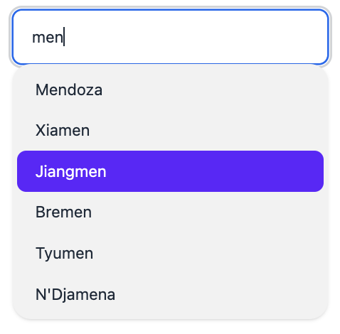
(the actual colors may differ depending on the selected daisyui theme)
tailwind
tailwind: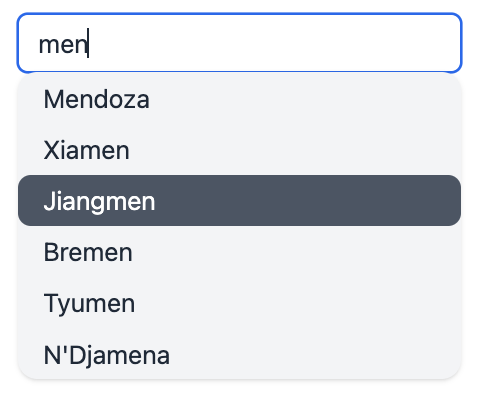
These defaults can be selectively overridden or extended using the appropriate options to live_select/3.
You can control the style of the following elements:
Here's a visual representation of the elements:
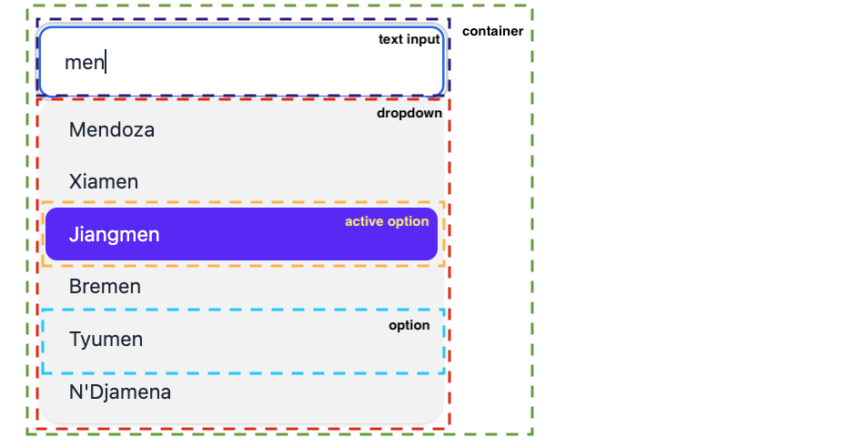
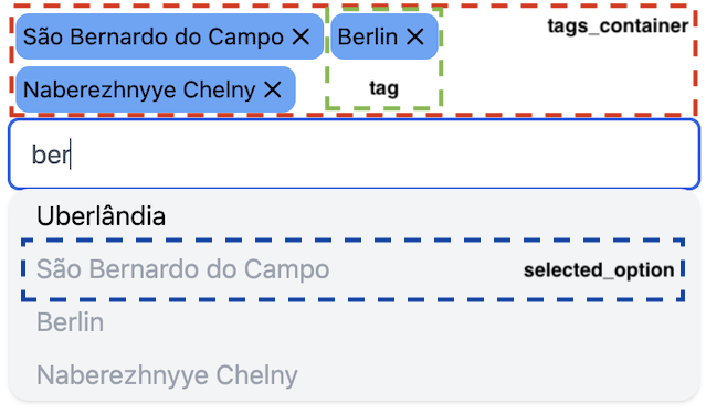
In tags mode there are 4 additional stylable elements:
For each of these elements there is an {element}_class and for some also an {element}_extra_class option, which can
be used
to override or extend the default CSS classes for the element, respectively.
You can't use both options together:
use {element}_class
to completely override the default classes, or use {element}_extra_class to extend the default.
The following table shows the default styles for each element and the options you can use to adjust its CSS classes.
| Element | Default daisyui classes | Default tailwind classes | Class override option | Class extend option |
|---|---|---|---|---|
| active_option | active | bg-gray-600 text-white | active_option_class | |
| available_option | cursor-pointer | cursor-pointer hover:bg-gray-400 rounded | available_option_class | |
| container | dropdown dropdown-open | h-full relative text-black | container_class | container_extra_class |
| dropdown | bg-base-200 dropdown-content menu menu-compact p-1 rounded-box shadow w-full | absolute bg-gray-100 rounded-md shadow w-full z-50 | dropdown_class | dropdown_extra_class |
| option | px-4 py-1 rounded | option_class | option_extra_class | |
| selected_option | disabled | text-gray-400 | selected_option_class | |
| tag | badge badge-primary p-1.5 text-sm | bg-blue-400 flex p-1 rounded-lg text-sm | tag_class | tag_extra_class |
| tags_container | flex flex-wrap gap-1 p-1 | flex flex-wrap gap-1 p-1 | tags_container_class | tags_container_extra_class |
| text_input | input input-bordered pr-6 w-full | disabled:bg-gray-100 disabled:placeholder:text-gray-400 disabled:text-gray-400 pr-6 rounded-md w-full | text_input_class | text_input_extra_class |
| text_input_selected | input-primary | border-gray-600 text-gray-600 | text_input_selected_class |
For example, if you want the options to use black text, the active option to have a red background, and remove rounded borders from both the dropdown and the active option, call live_select/3 like this:
live_select(form, field,
active_option_class: "text-white bg-red-800",
dropdown_extra_class: "!rounded-xl",
option_extra_class: "!rounded-lg text-black",
style: :tailwind
)Selectively removing classes from defaults
You can remove classes included with the style's defaults by using the !class_name notation in an {element}_extra_class option. For example, if a default style is
rounded-lg px-4, using an extra class option of!rounded-lg text-blackwill result in the following final class being applied to the element:
px-4 text-black